Social Live
My role: Senior Product Designer.
Team: Product manager, CEO, Backend and Frontend developers.
Tools: Figma.
Year: 2022.
1. Background
The Social Live service from Gazprom allows company employees to get information about possible ways of organizing their life when working on field sites. The implementation of even the most large-scale investment projects ultimately depends on the specific workers on the site. Delays in projects are often caused by untimely relocation of workers to the site or inefficient logistics from their accommodation to the workplace. These issues are expected to be resolved with the help of the developed product. It will allow employees of contracting organizations to get information about available accommodations, food, leisure activities, and quickly organize their life on the site, and for employees of «Gazpromneft Khantos» — to update this information conveniently.
2. Problem
The interface of the application section is complex and unfriendly to use. The commandant, whose task is to approve employees' applications for settlement, performs his duties inefficiently due to the complexity of the interface. Users of the service are elderly people, so it is important to address accessibility issues in the interface.
3. Solution
The interface of the application section and the employee list viewing needs to be rethought. It is required to adjust the visual hierarchy so that each element performs its function and is easy to read without unnecessary cognitive load.
4. Old Service Design
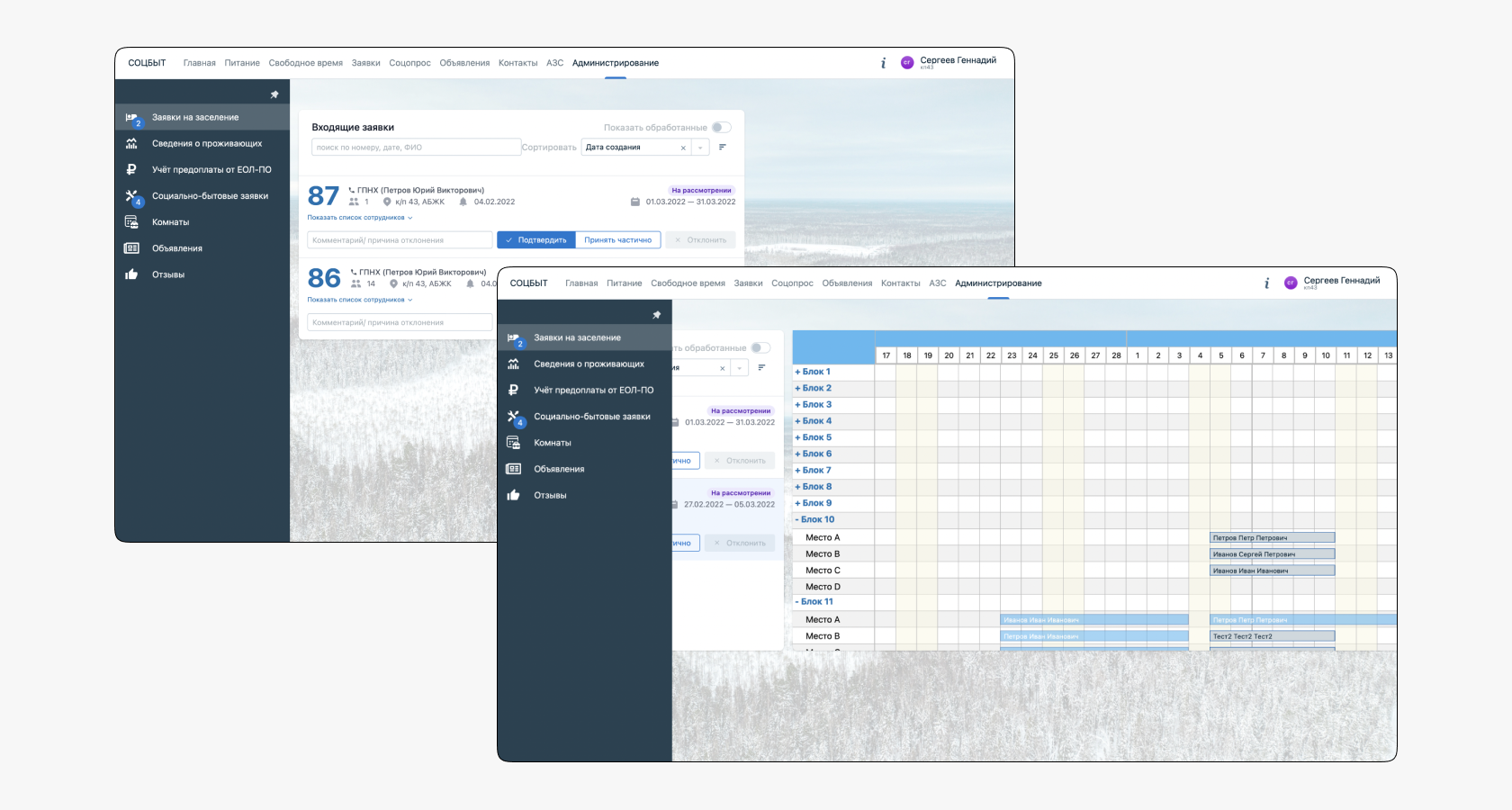
4.1. Inefficient Use of Space
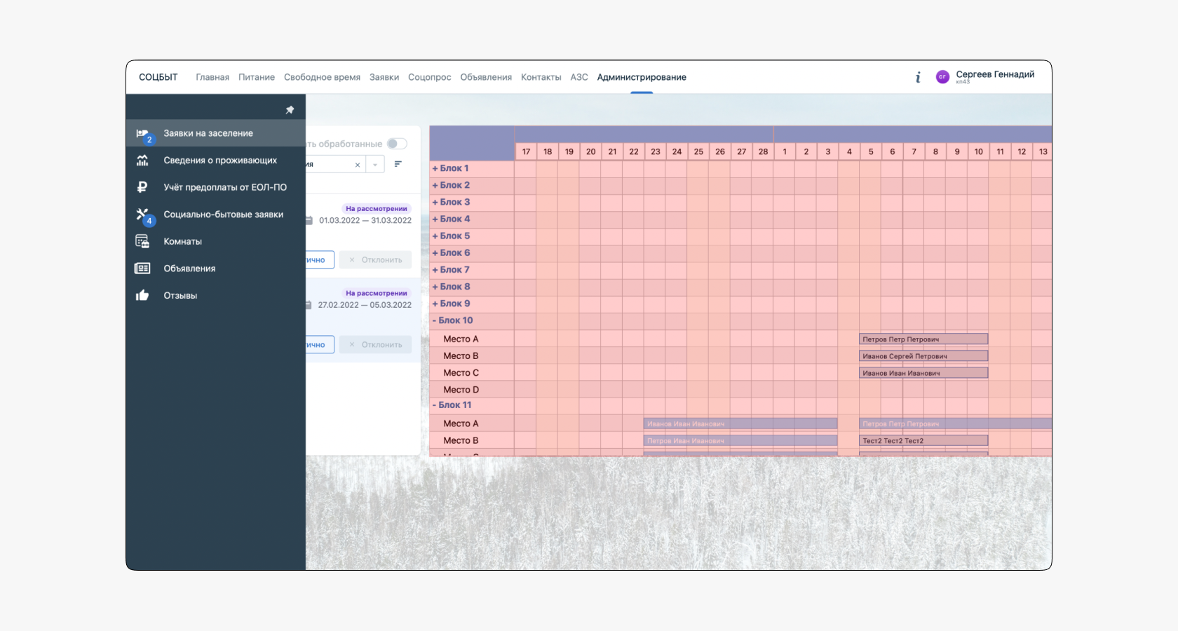
Most of the interface is cluttered with visual debris in the form of background images that serve no purpose but are always present on the user's screen. Useful and necessary content takes up significantly less space, making the interface difficult and inconvenient to use on multiple large monitors.
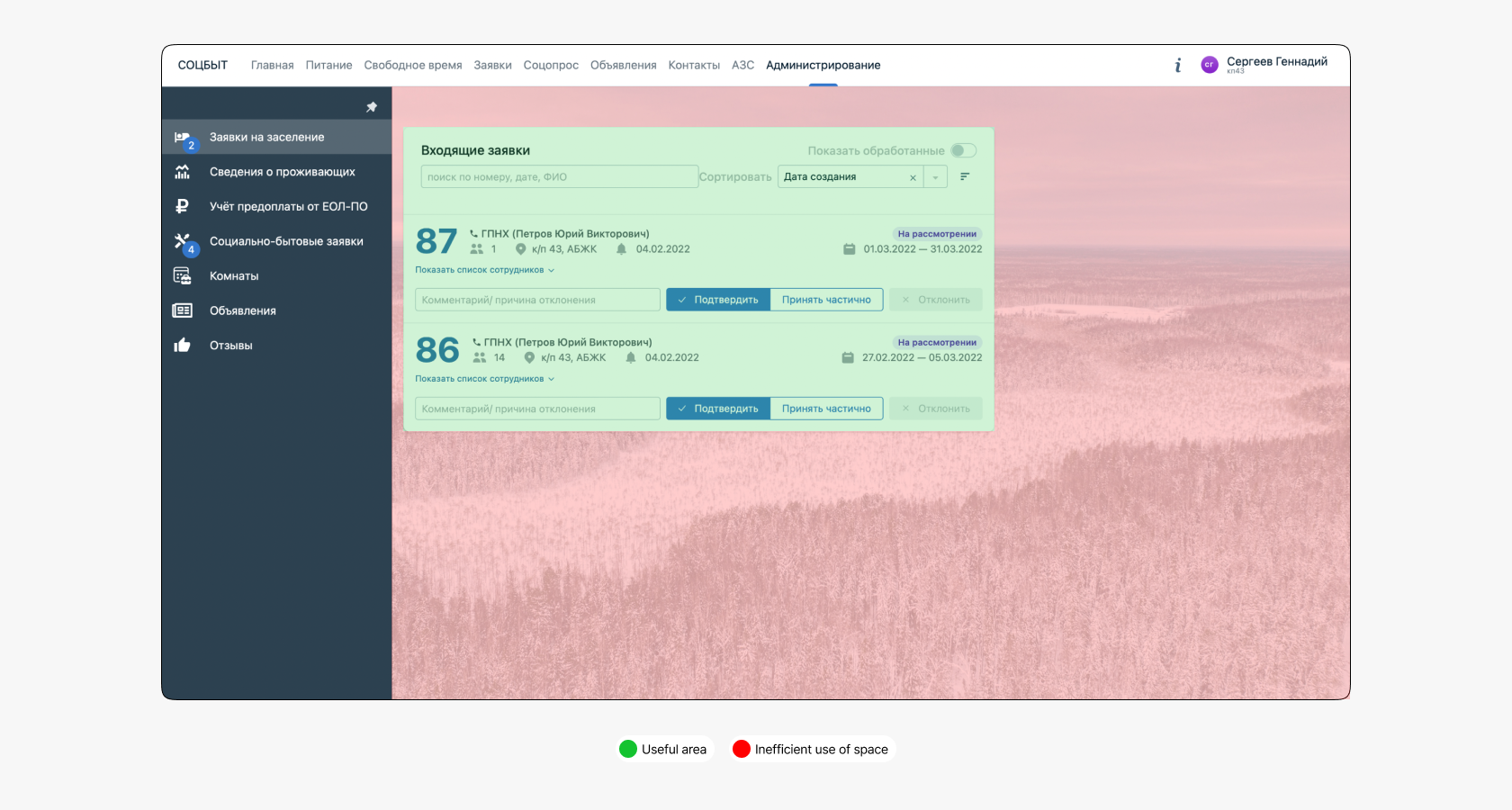
4.2. Unintuitive Employee List Interface
The application card has a «Show Employee List» button that gives a misleading impression of its behavior. The user expects the employee list to expand within the card, as the arrow icon indicates direction, but in reality, it is quite different. After clicking the button, the application cards shift left, and a block with Gantt chart data appears on the right. This behavior makes the interface unpredictable and gives the user a false impression, reducing satisfaction.
4.3. Gantt Chart
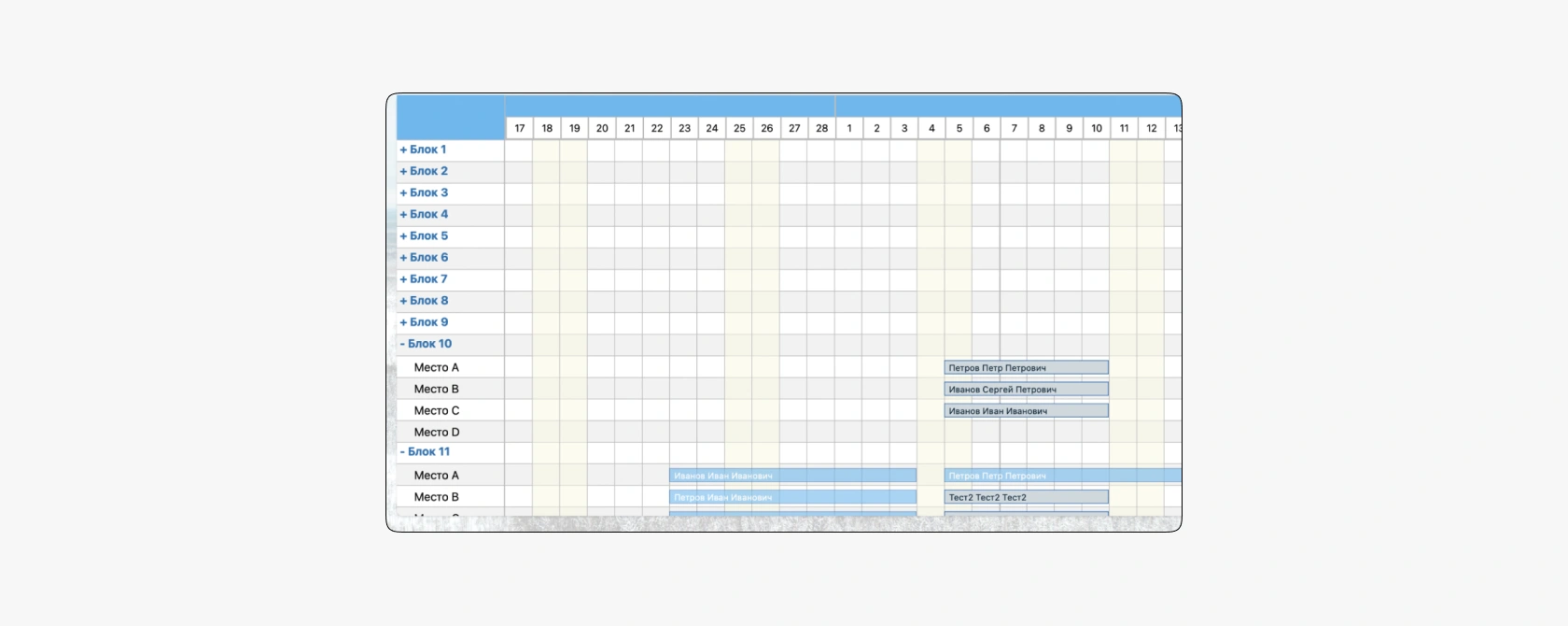
When opening the employee list, the commandant does not see anyone, only an empty calendar grid without snippets and a list of blocks where employees are housed. To find out where the workers live, one has to go through each block and find the right person.
5. Redesign
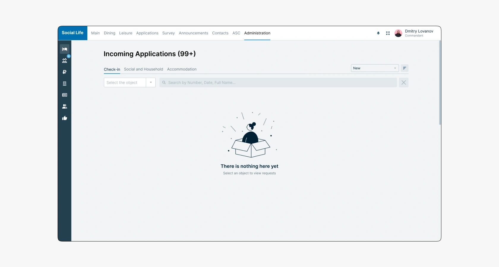
The application section has become an aggregator, including applications for settlement, accommodation, and social and household issues assistance. This solution minimized the number of sections in navigation and created a single entry point where the commandant can quickly perform his tasks. As a result, problems related to space usage disappeared, as did the background image. The list of applications is now visible and understandable.
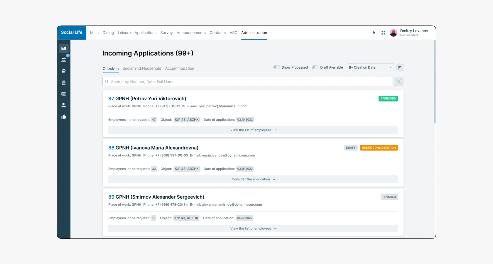
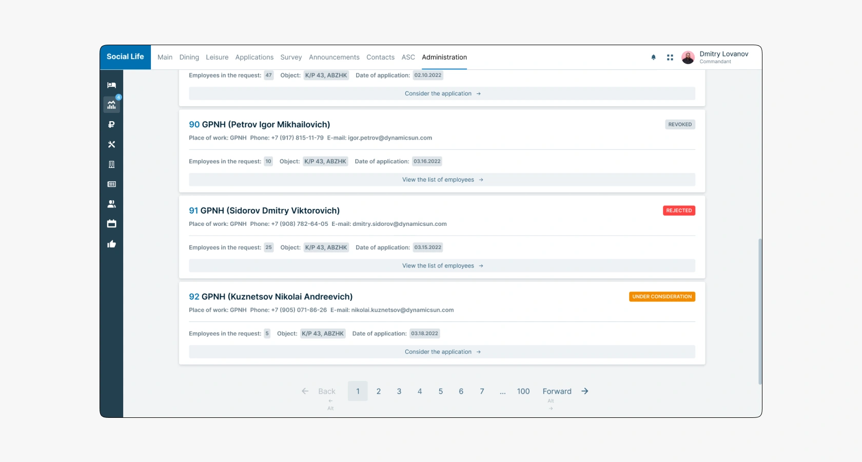
Ten application cards are loaded on each page. To view more, the commandant needs to switch to the next page. For proactive users, there is an option to switch pages using hotkeys.
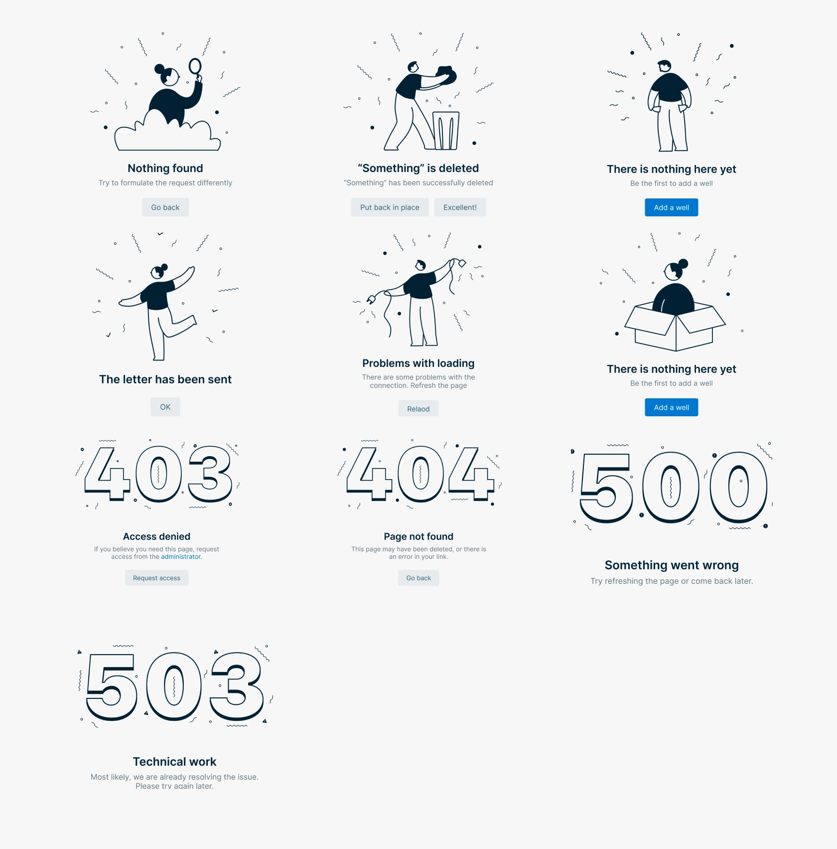
Illustrative explanations are displayed in contentless states. Each scenario has its image. Errors use a numerical code. Images are accompanied by text descriptions and action buttons.
5.1. Application Card
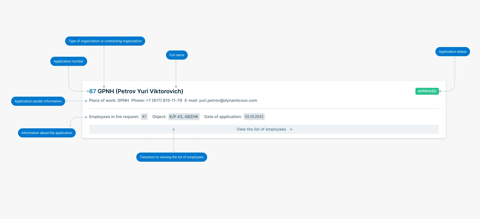
The structure and visual hierarchy of the card were revised. Information is divided into several parts: at the top are the sender's data, and at the bottom the application data (number of employees, object, and date). We abandoned the application approval buttons, as the commandant cannot make a decision without studying the task. Therefore, approval or rejection can only be done by going to the employee list page. The size of the ordinal number and the title were equalized. The initially large font of the number did not serve any purpose, only distracting from quickly reading the application list. All parts of the title are bolded to separate them from secondary elements. Sender details became more understandable after abandoning icons in favor of text indication.
Overall, the new design helped reduce cognitive load, simplify and structure the hierarchy of components, and speed up working with the interface.
5.2. Employee List
The employee list viewing section was completely redesigned. It now opens in a separate tab, allowing the commandant to focus on making a decision to approve a particular application. If the commandant needs to return to the application list, he can switch to the previous browser tab.
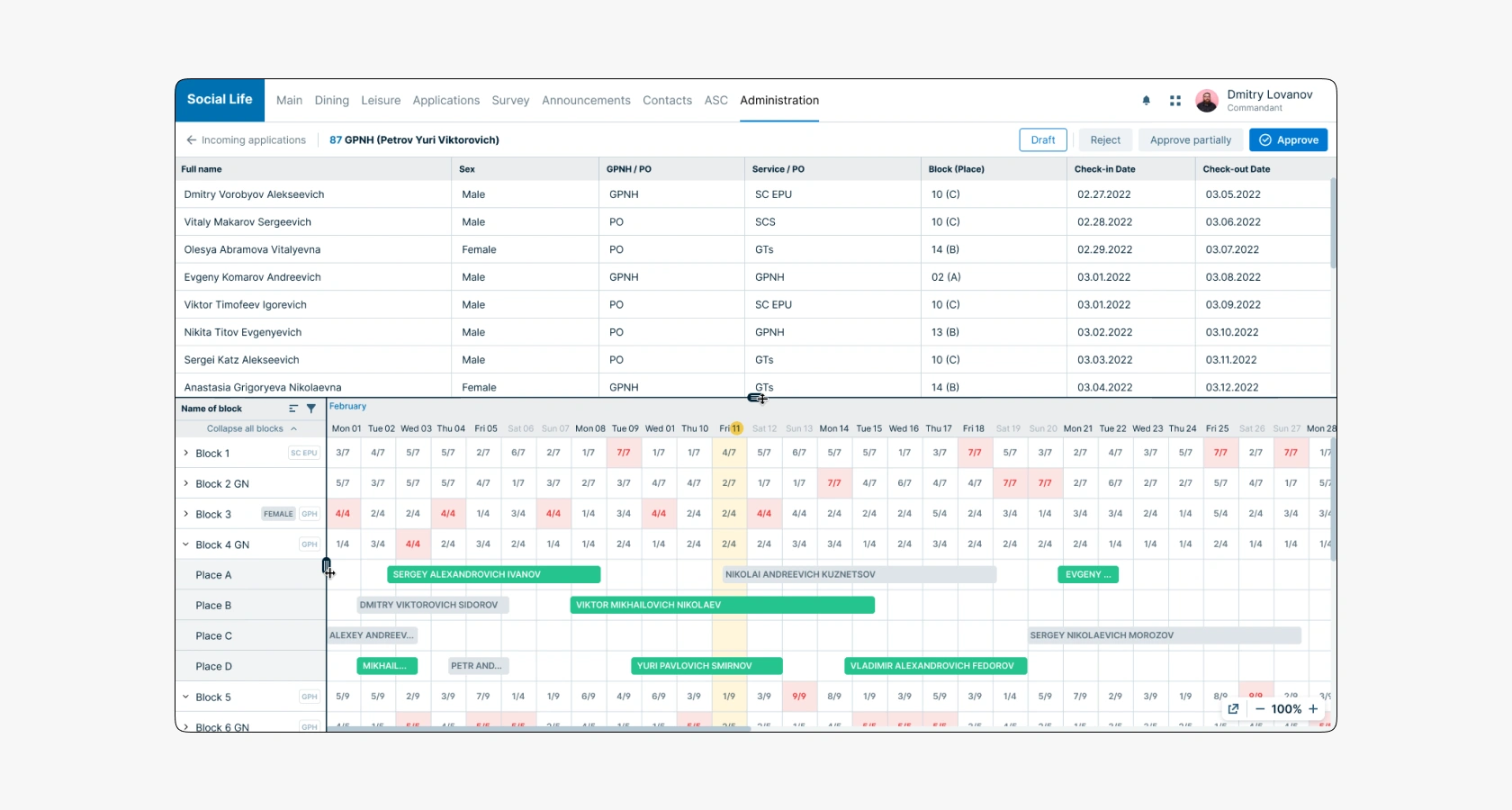
The new design solved the main problem of not being able to work simultaneously between the employee list and managing their settlement in blocks. This is facilitated by dividing the interface horizontally into several parts: at the top is a table with the employee list and additional details, and at the bottom is a Gantt chart where the commandant assigns places and periods of residence.
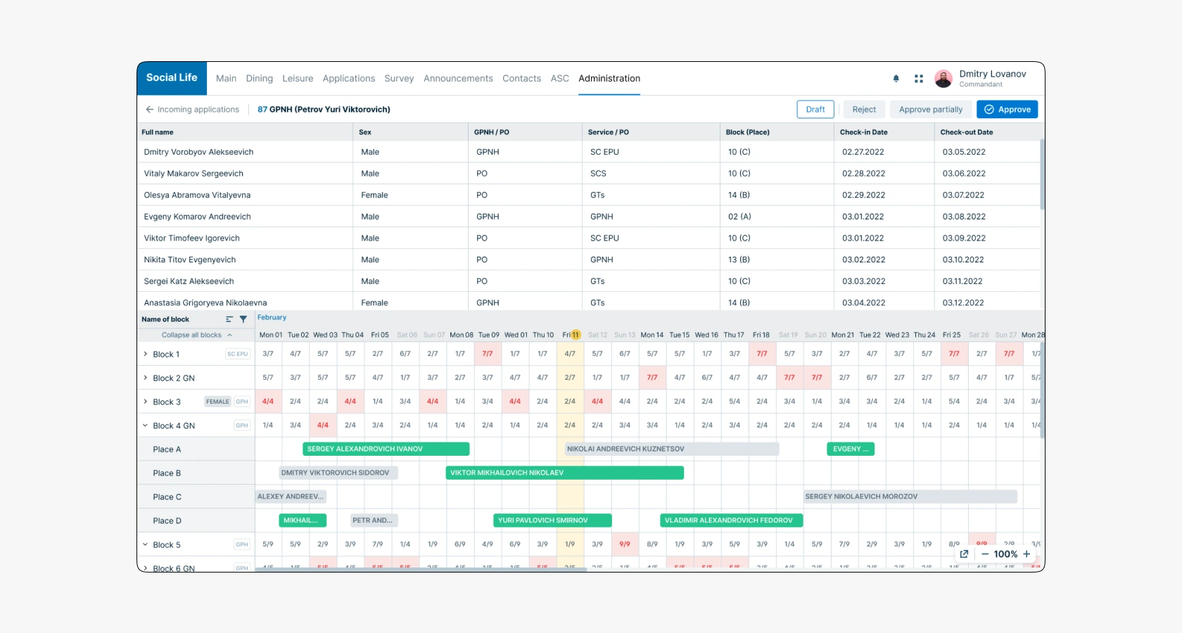
All employees in the application have the following data: full name, gender, place of work (GPNH — Gazprom employee or PO — contractor), service, place where the employee was settled, and dates of arrival and departure from the accommodation. The commandant can flexibly manage the employee data. He can apply sorting and filters for each column of the table.
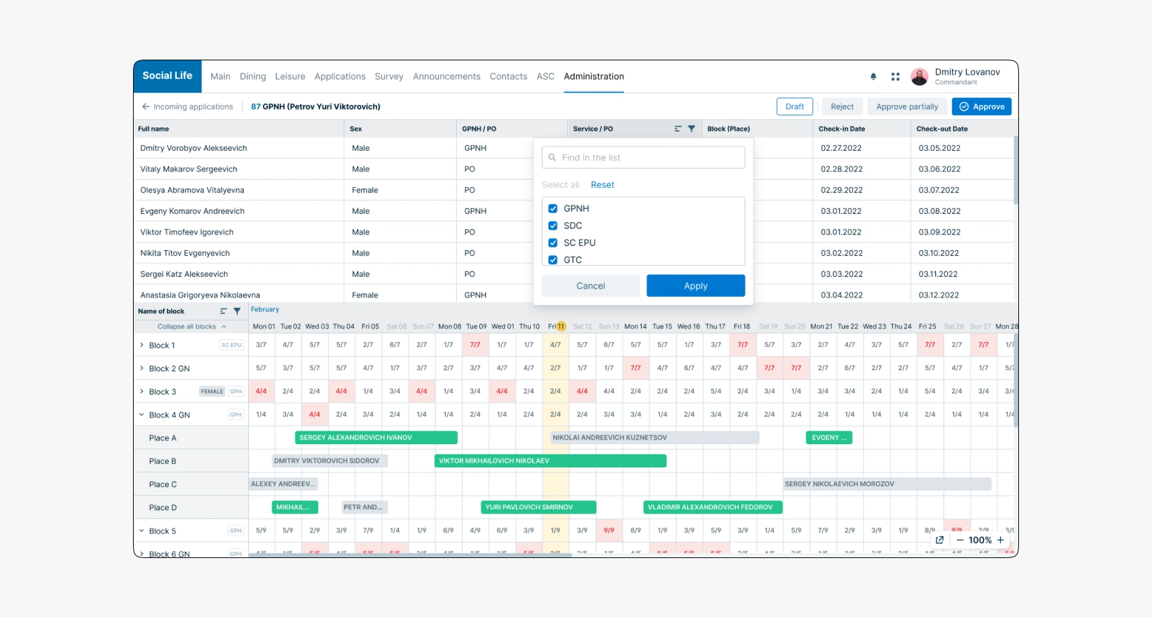
5.3. Gantt Chart
The Gantt chart component was completely redesigned. In the old version, it often did not provide useful information in some states. For example, if the commandant did not expand any of the blocks, the calendar grid was empty. In the new version, this space is used to display information about block occupancy for each day. The number of available places and the total number of places for settlement are now displayed as fractions. With color coding, one can quickly determine where there are free places and where all places are taken (the cell is filled with red). Occupancy statistics are displayed only at the block level, and there is no such indication in the room cells because employee snippets are displayed there.
The decision to display information on occupancy improved the interface's predictability. The commandant now does not need to interact with the interface to get information. Now he just needs to look and immediately understand the situation.
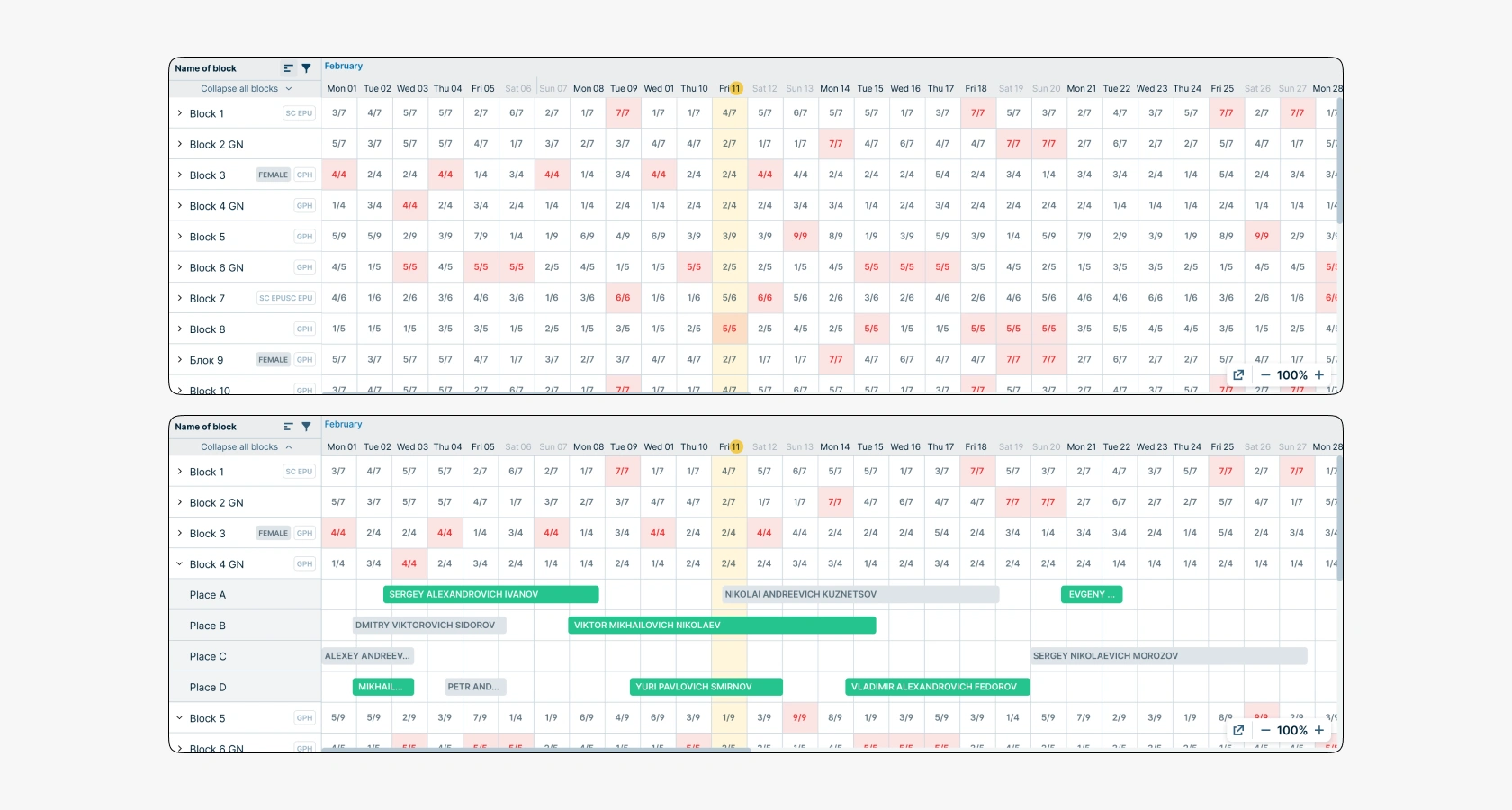
5.4. List of Blocks in Gantt Chart
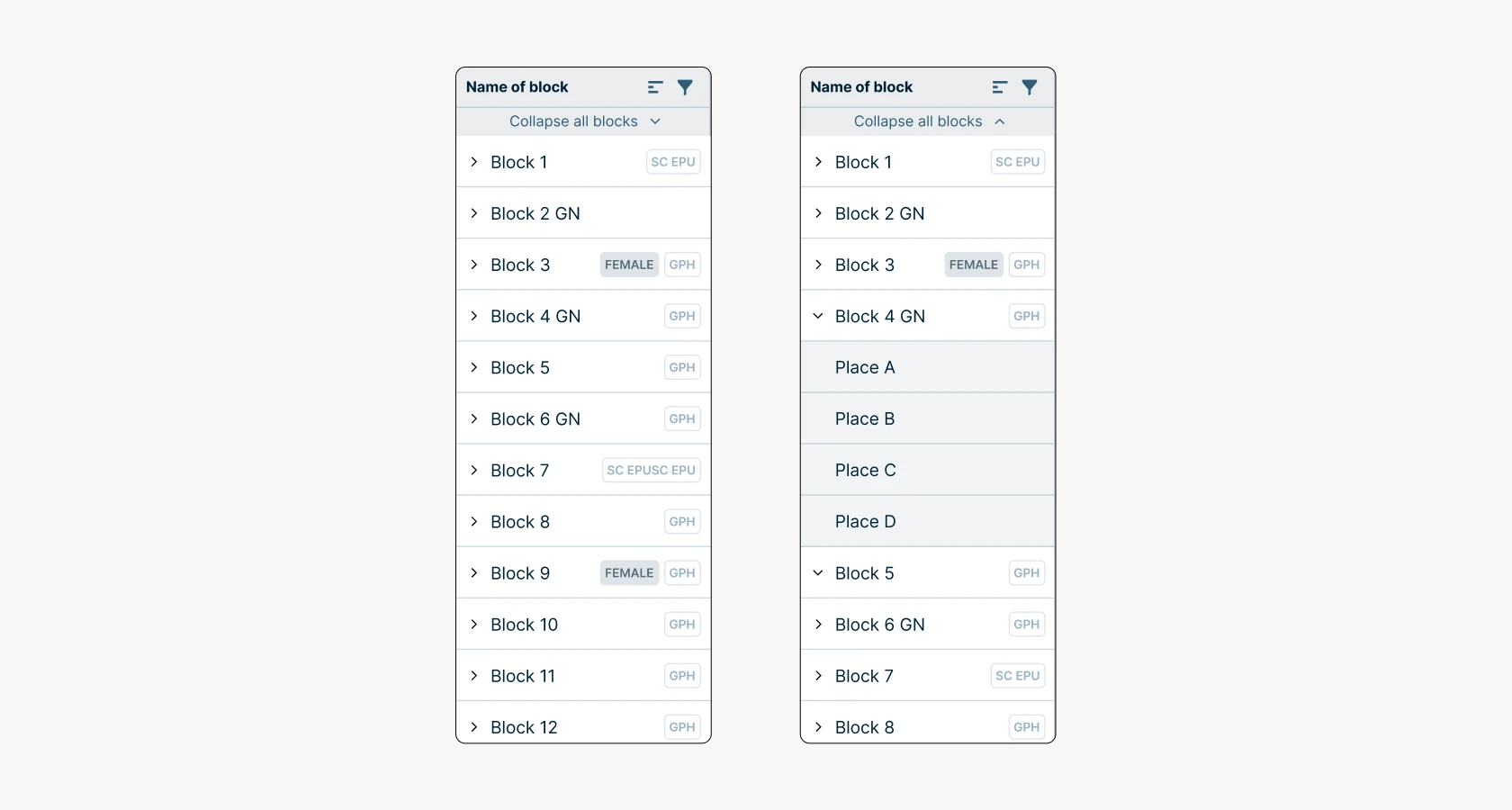
The component of blocks where employees are settled was improved. The commandant can find specific people by specifying filter criteria (full name, gender, etc.). The ability to quickly expand and collapse all nested levels of blocks was added.
The block name — this is a field for free input of the name, the company has an agreement that Block 1 — this is the company's property with a note. Block 1 GN — this is a partner's hotel room. To the right of the block name tags indicating affiliation with a specific organization (GPNH or PO) were added, as well as designations in the form of the letter M — female block. These innovations help the commandant better understand which employees to settle together to avoid disagreements and discrimination, and also provide an opportunity to communicate, having common hobbies and tasks.
The decision to display information on occupancy improved the interface's predictability. Now the commandant does not need to interact with the interface to get information. He just needs to look at it and immediately understand the situation.
5.5. Calendar Grid
It has become more convenient to manage employee placement in the Gantt chart. The employee snippet management interface was improved, and now the commandant can move the employee snippet using drag and drop. In the hover state, handles appear at the edges of the snippet, allowing the user to expand or shrink the number of days the employee stays in the block. Additionally, when hovering over the snippet, an icon with a question mark appears, and when hovered over, a tooltip with employee data is displayed.
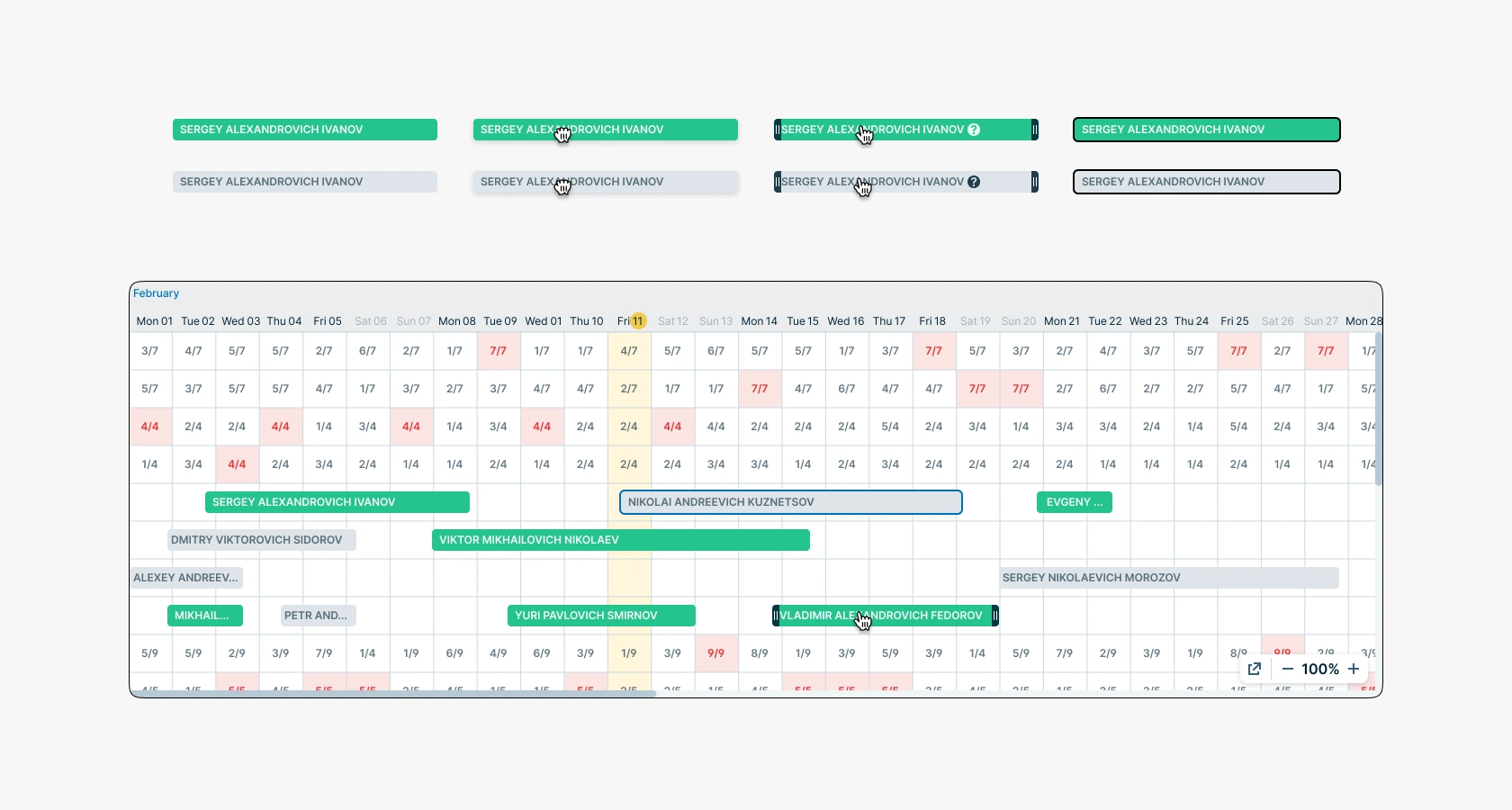
5.6. Employee Placement Management
To manage employee placement, the commandant can manipulate the snippet in several ways. For example, simply dragging and dropping it within the same block or to another one. When hovering over another placement block, it will automatically expand for selection. After dragging the snippet, the user will be prompted to confirm the action, and after confirmation, a successful action indication will be displayed.
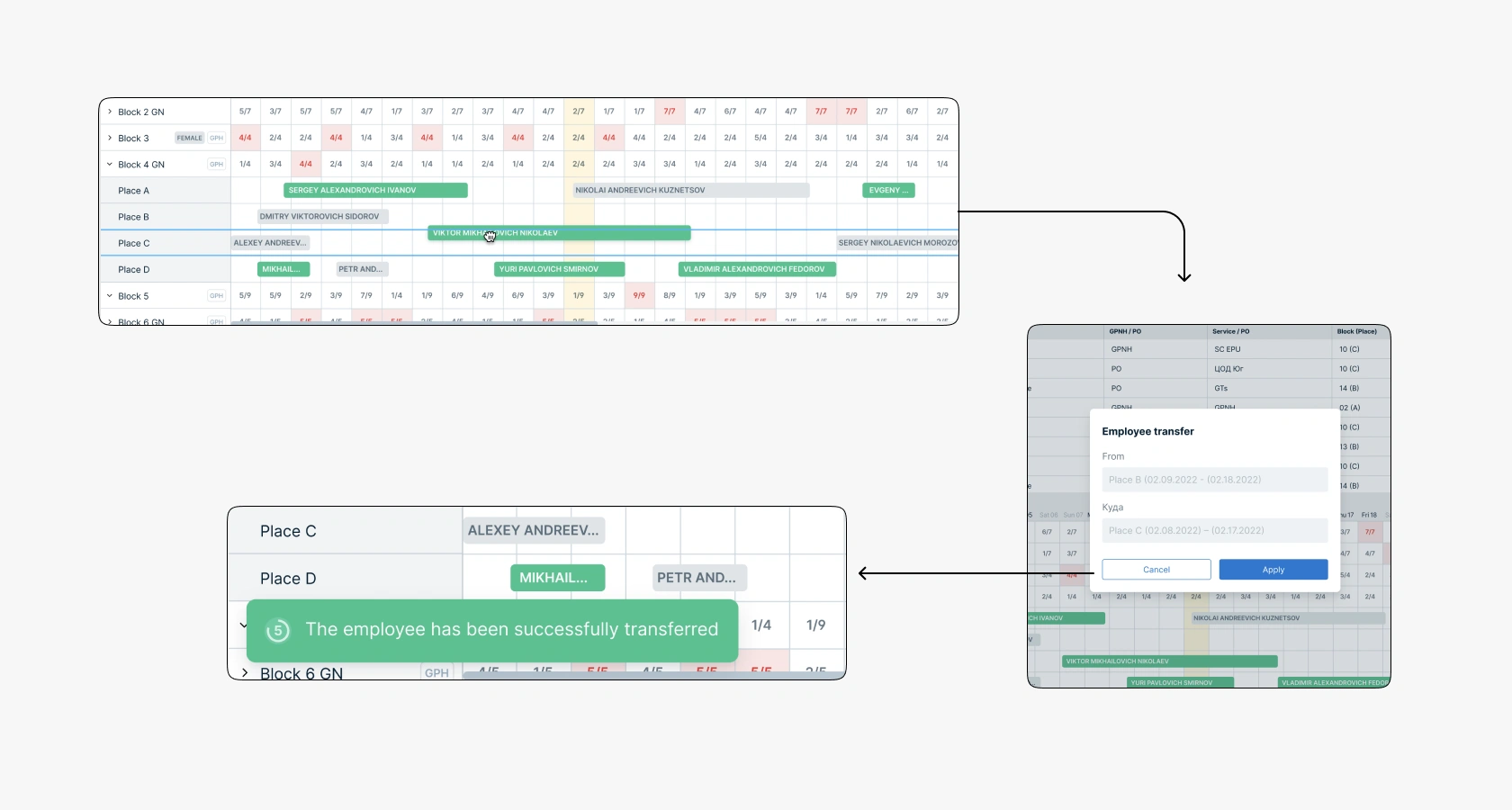
If the commandant moves an employee to a place where everything is occupied, the action will not be performed. In this case, a red indication will appear on the line, and the cursor will change to «unavailable». If the left mouse button is released, the snippet will return to its original position.

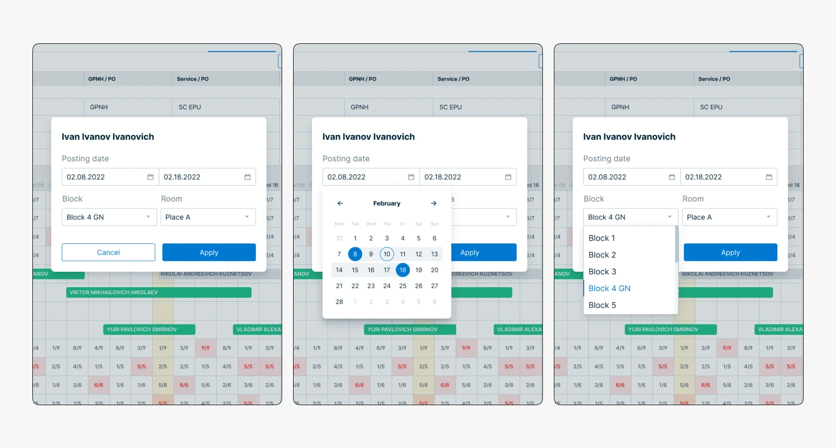
But there are cases when it is necessary to move an employee from Block 1 to Block 100. Dragging over such a distance will be inconvenient and problematic, as element-by-element loading is required and the snippet's position may change. Therefore, there is a manual relocation mode in a pop-up that opens when clicking on the snippet. It contains fields for entering the placement date, block, and room selection.
5.6. Resizing Elements
The employee list interface is very flexible in settings. The commandant can adjust the size of areas depending on his needs. For example, if he needs to view the employee list, and the Gantt chart is not needed, he can reduce the Gantt size in favor of the list or vice versa. To increase or decrease the viewing coverage, the commandant can adjust the scale or open the Gantt chart in a separate tab.
5.7. Application Approval
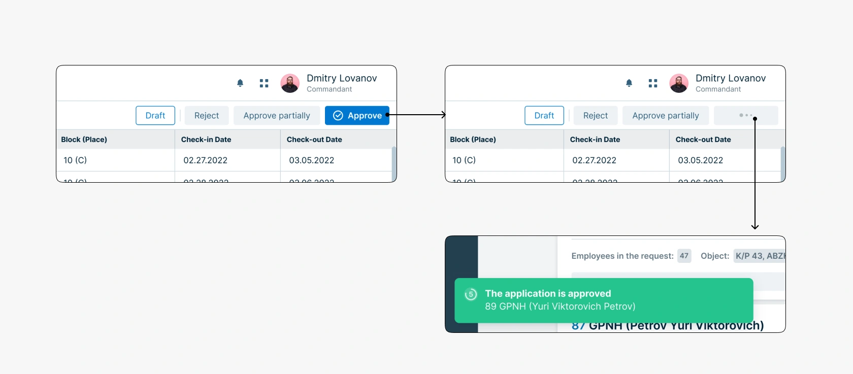
The commandant can approve, partially approve, or reject an application. To fully approve an application, the commandant just needs to click the «Approve» button and wait a while (if the application has many participants, the processing time may increase). After this, there will be a redirect to the application list and a successful action notification will appear, disappearing after 5 seconds.
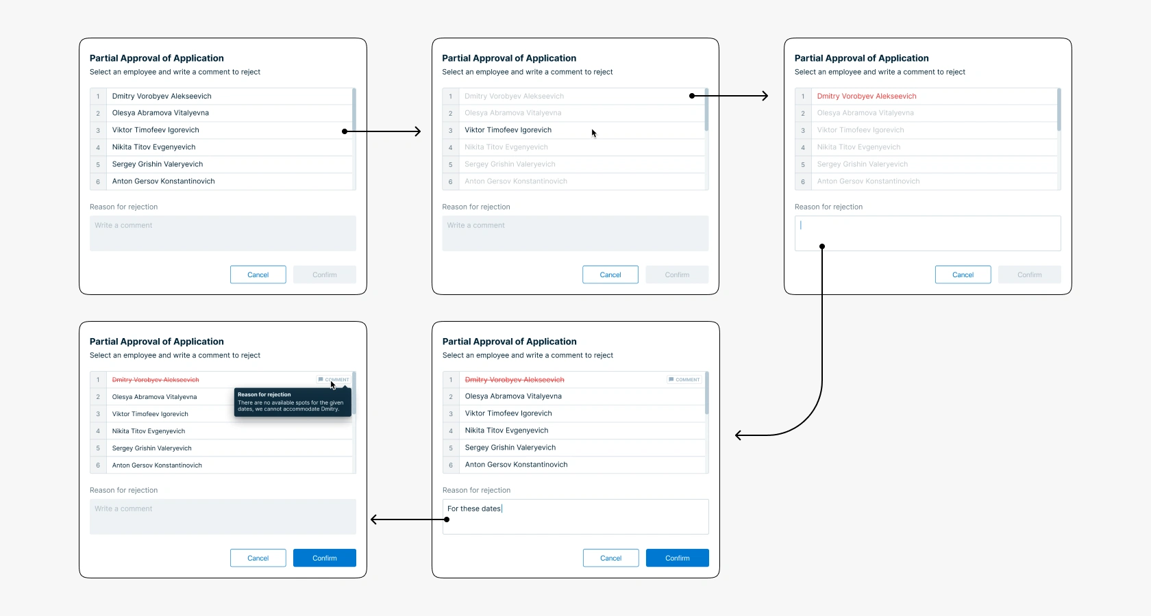
If an application can be approved partially, the commandant needs to select those employees whose placement cannot be approved and write the reason for rejection. To indicate unapproved placement of an employee, the commandant needs to click on the name so that it turns red, write the reason for rejection. If at least one character is entered, a «comment» tag appears to the right of the employee's name which, when hovered over, displays a tooltip with the rejection reason text. To specify another employee, the commandant can just select another user, then the text in the rejection reason block will be reset.
The service is designed based on the Consta design system. To design the new interface, it was necessary to study the component documentation, agree on changes with the Front-end and Back-end teams, and also introduce new components into the design system and create guides for them.
