Illustrators.ru
My role: Senior Product Designer.
Tools: Figma
Year: 2022.
1. About the Project
Illustrators.ru is a community of artists, illustrators, and those who need to order some work. Every practicing illustrator can create their unique page, upload their works, and share their knowledge, news, or just thoughts on illustration and art in general with the audience.
2. Problem
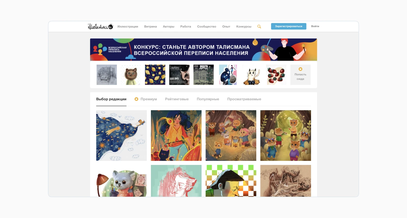
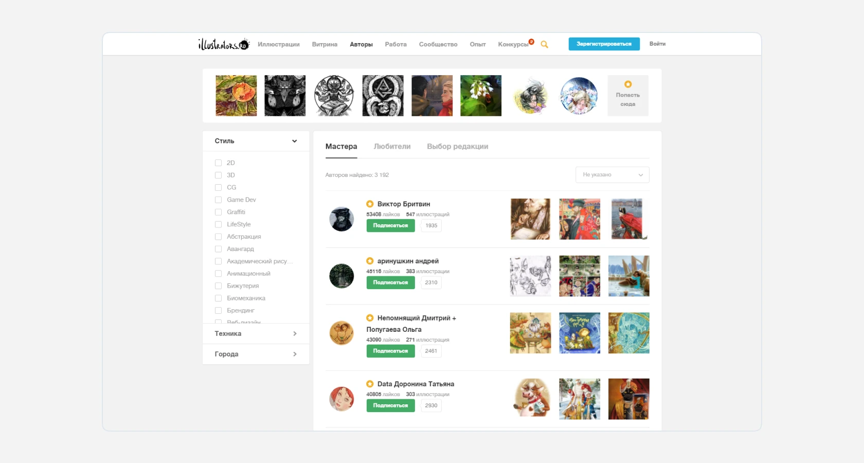
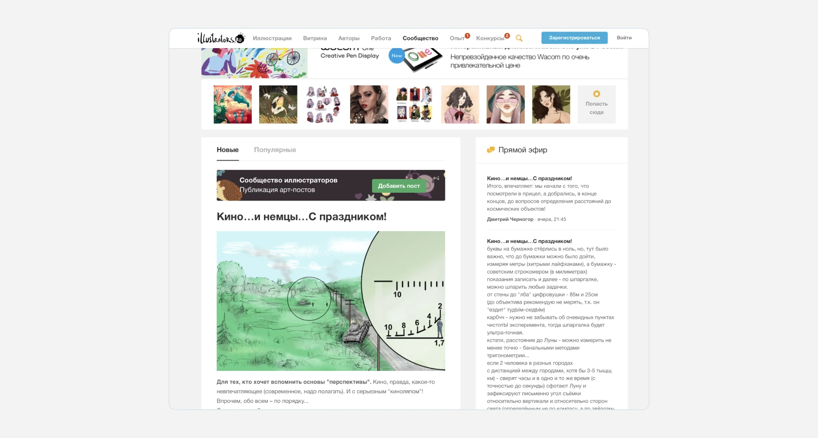
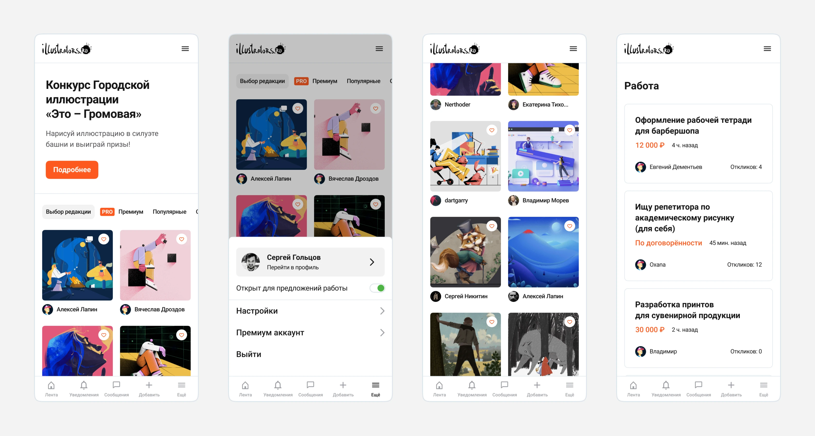
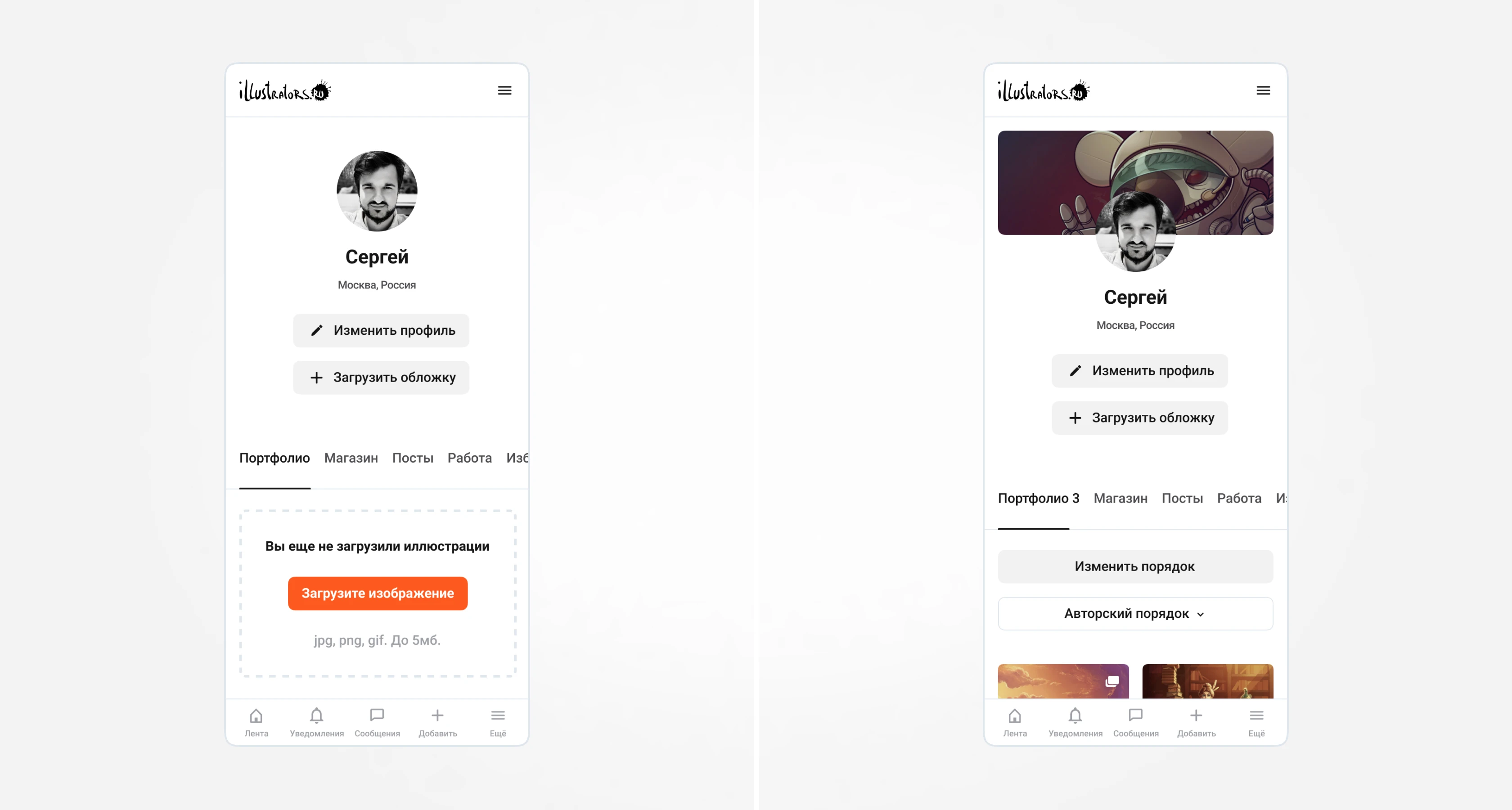
The service is not attractive to a young audience. The site does not have responsive design or a mobile version, yet 45% of users visit the site from mobile devices. The current site design is quickly becoming outdated, so a new visual design needs to be created that will remain relevant over time.
3. Solution
A redesign of the site is necessary to address the pressing issues, improve interface accessibility, and prioritize user content over the site interface.
4. Redesign
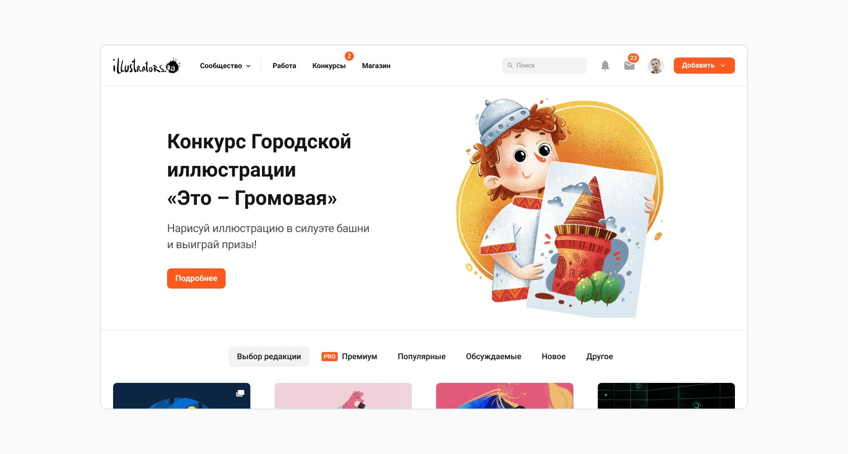
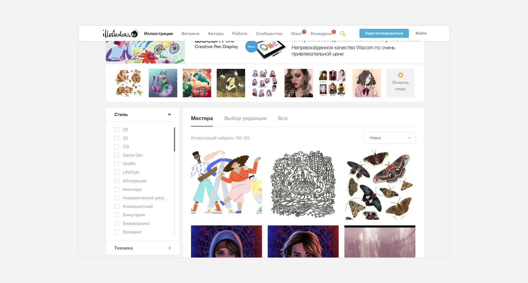
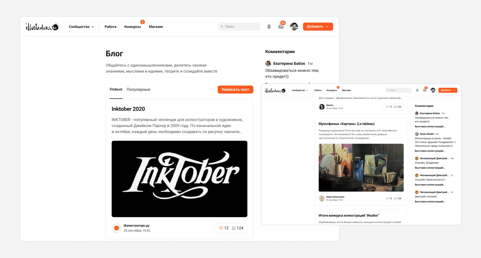
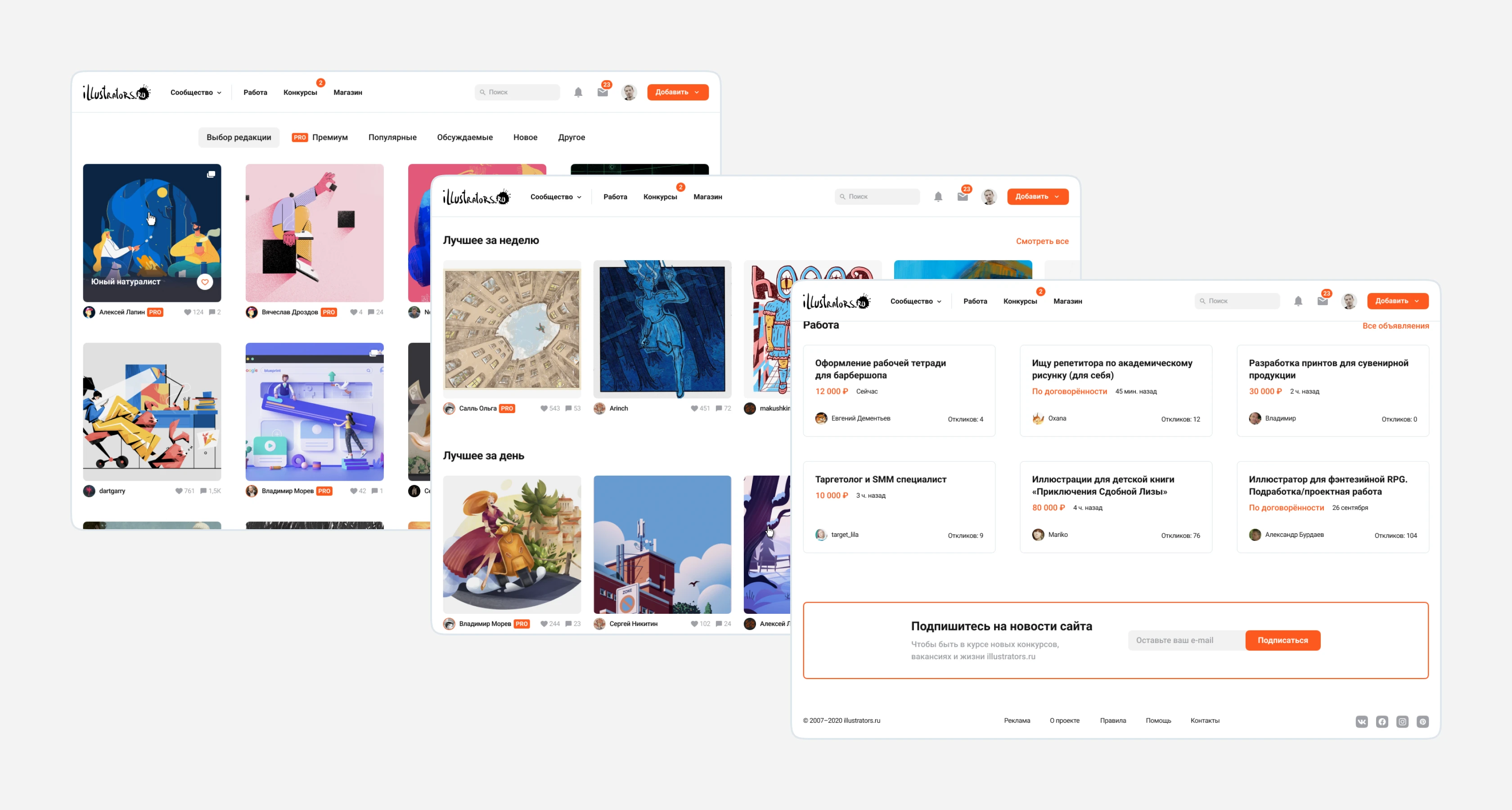
To understand the tasks that the redesign needs to solve, we analyzed data from Yandex.Metrica. Based on the data obtained, it became clear that the most visited sections are "Work," "Contests," and "Showcase." This data helped to reconsider the routing and simplify navigation in the site header. Of the previous seven sections, we left only four: "Community" (with the "Illustrations," "Authors," and "Blog" sections in the dropdown) and the sections "Work," "Contests," and "Showcase." This grouping of sections helped reduce the number of links and lighten the interface, reducing the cognitive load on users.
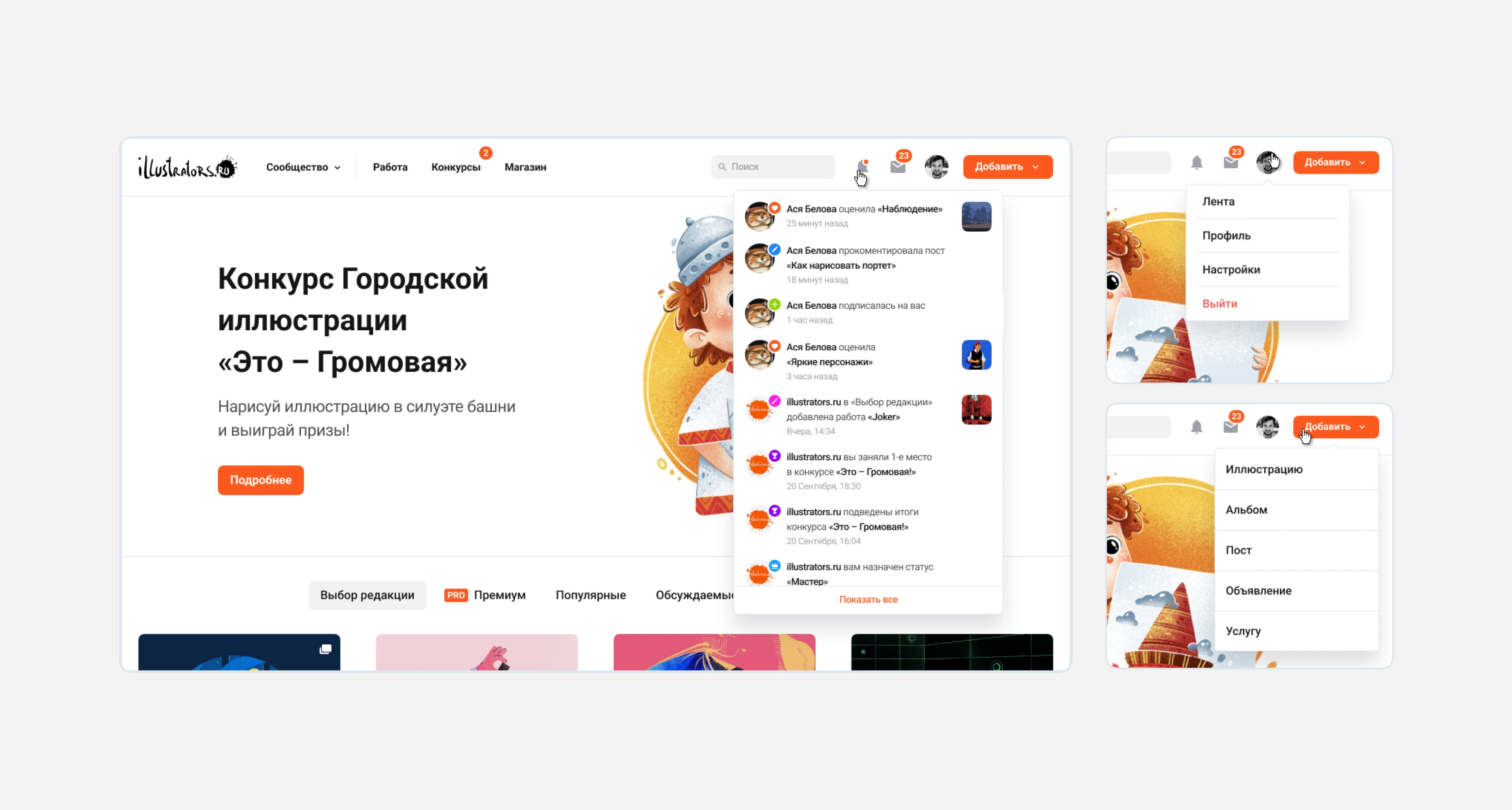
One of the weaknesses of the old design was the difficulty in delivering contest announcements and other news to the audience, so we added a text-graphic slider on the Hero screen, as well as notifications about new contests in the menu. If there are no news items, the block can be disabled in the admin panel.
Illustrations
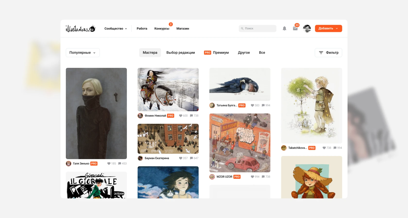
In the old site design, content was always secondary. We solved this problem by simplifying the rest of the interface and making it homogeneous. We increased the area for user content and abandoned the single preview format. Illustrations have a fixed width but not height. This way, when viewing the gallery, fatigue is avoided, and the eye always catches on new preview formats. Filtering and sorting are placed at the edges of the tags.
There are many illustrations with a white background on the site. To ensure that blocks with a large volume of such works do not break the visual structure, a light translucent overlay is added to the preview. This way, the counterform of such images will always be readable.
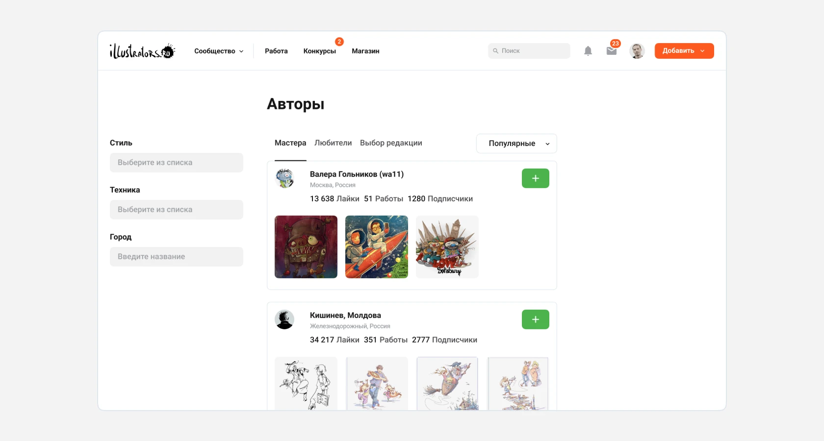
Authors
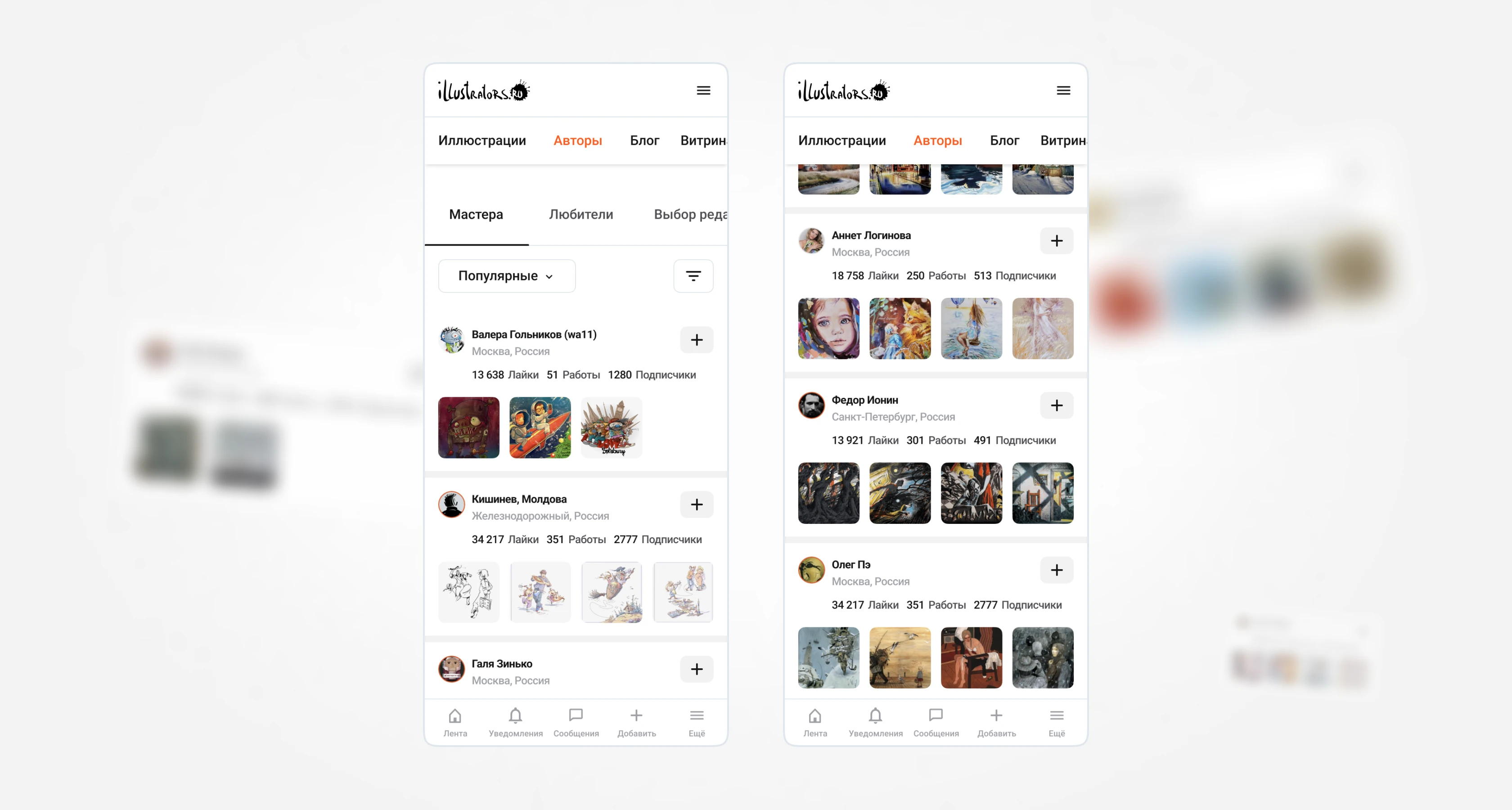
Searching by authors has now become more convenient. The basis of this page is user cards. They contain an avatar, username with a nickname in brackets, city, statistics, and up to four recent works in preview. The new design immediately draws attention to the main entity. The user output is formed proportionally, and then the option to go to the next page is offered.
User Profile
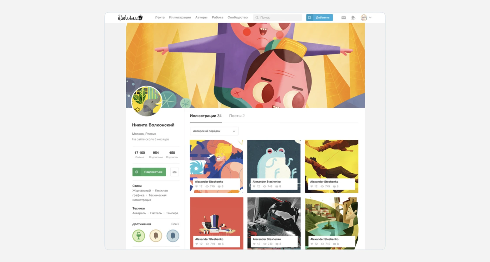
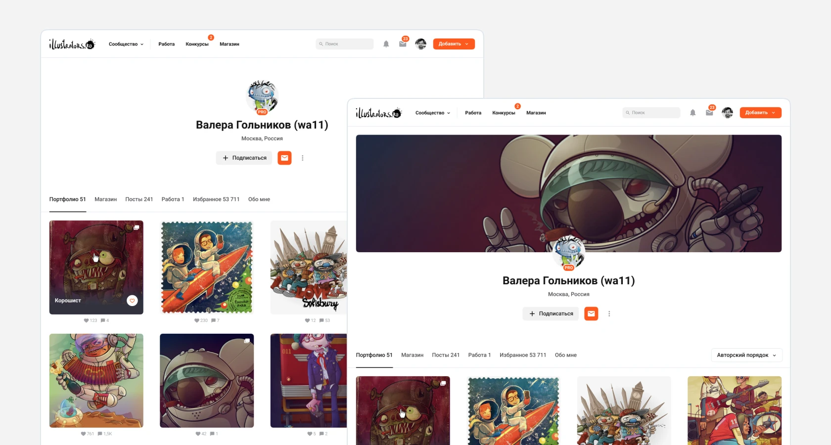
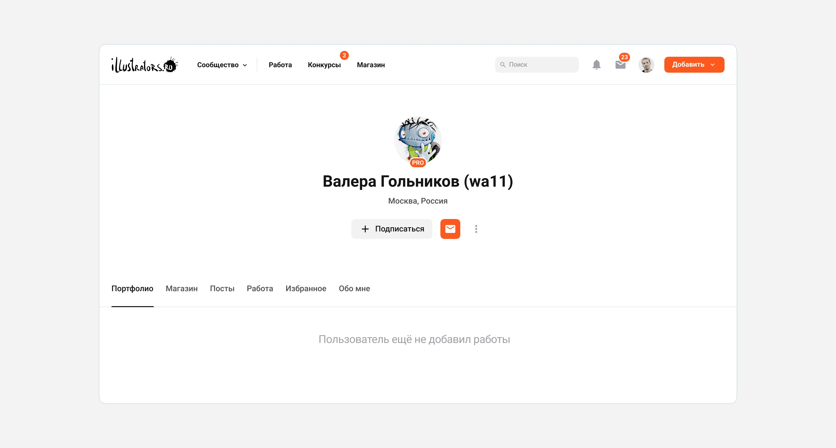
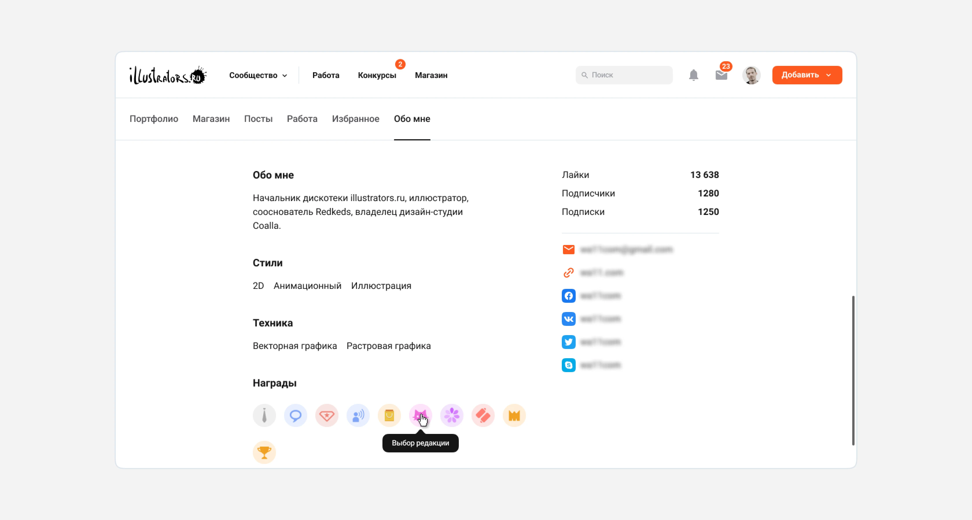
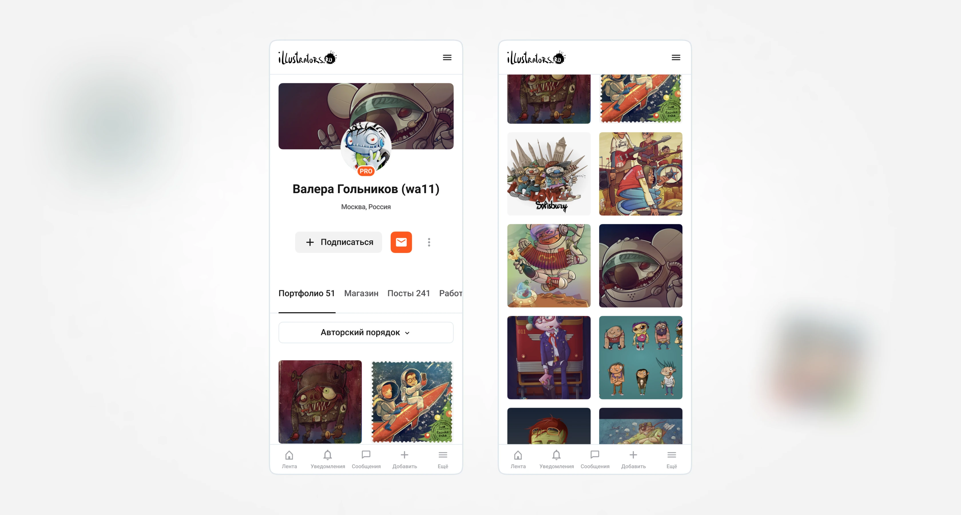
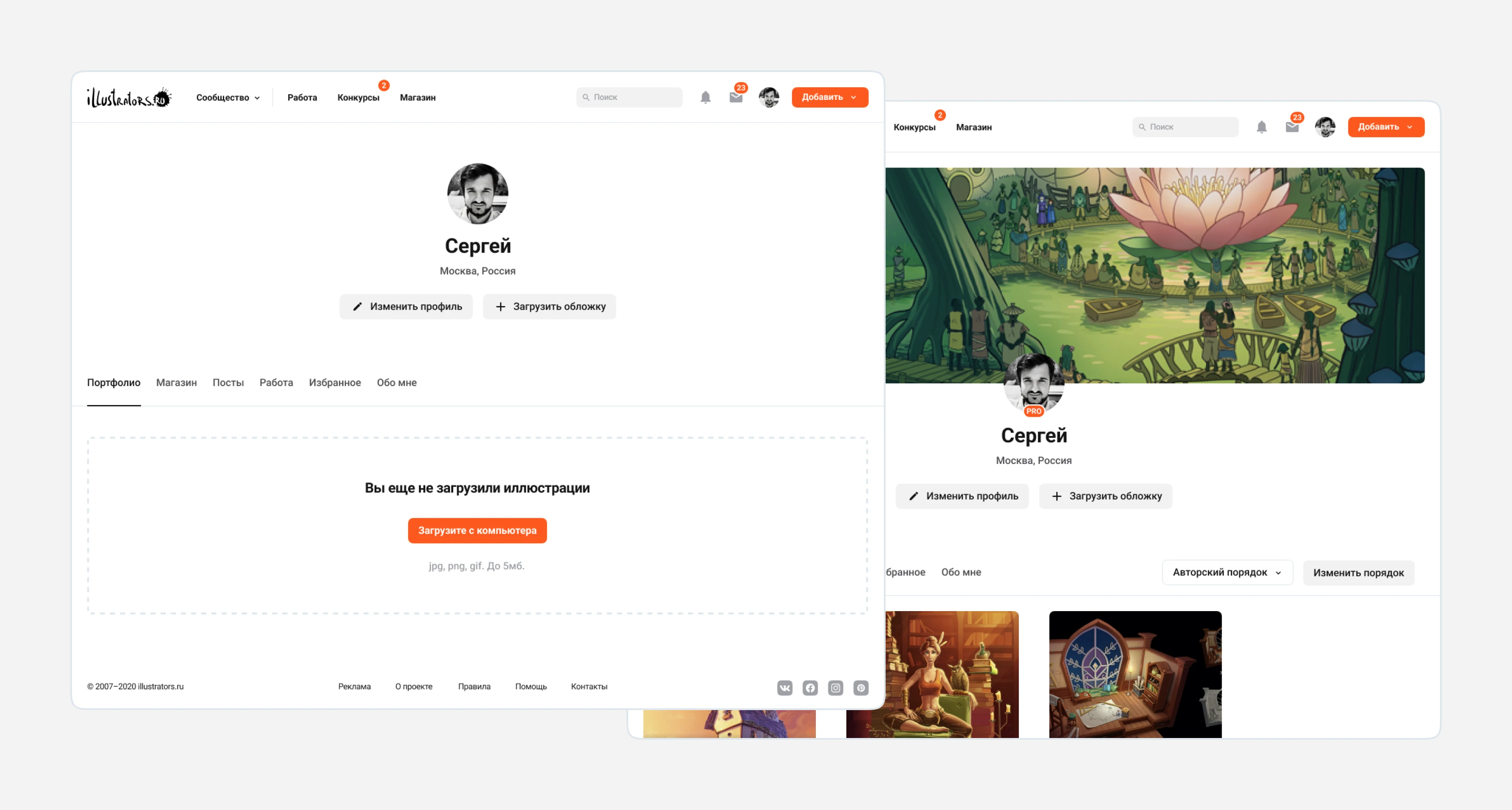
The user page on the site serves as a portfolio. Users can share links to it with clients and potential customers. Premium users can add a branded profile cover. By default, the "Portfolio" section is selected, displaying the most recently added works. If a premium subscription is connected, the user can set their "Custom Order." The available sections are: store (here are the works the author has put up for sale), posts (blog posts), favorites (here are sections with favorite works), and author information with descriptions and links to other social networks. The old design had a complex structure: a block at the top, a block on the left, a block on the right. To make it easier for the user to read the content from top to bottom, we redesigned the layout.
Your Profile
If the user has not uploaded any works, then a drag and drop area is available in the portfolio section area for uploading. You can also click the button to invoke the system file picker for file selection. Main actions: go to profile editing and upload a cover.
Work
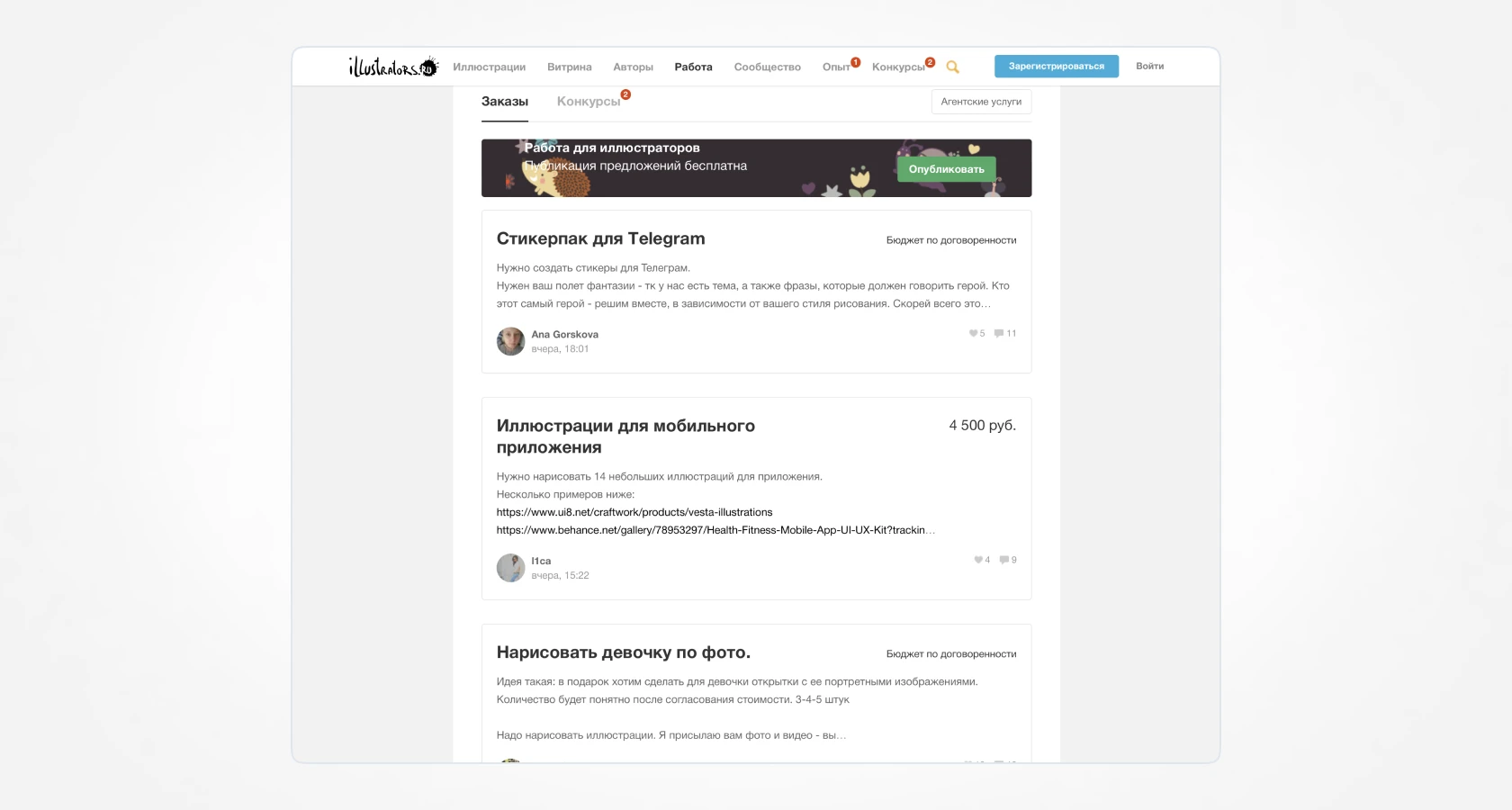
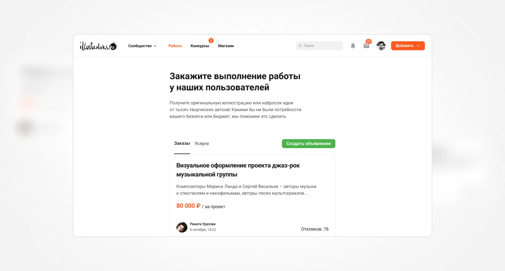
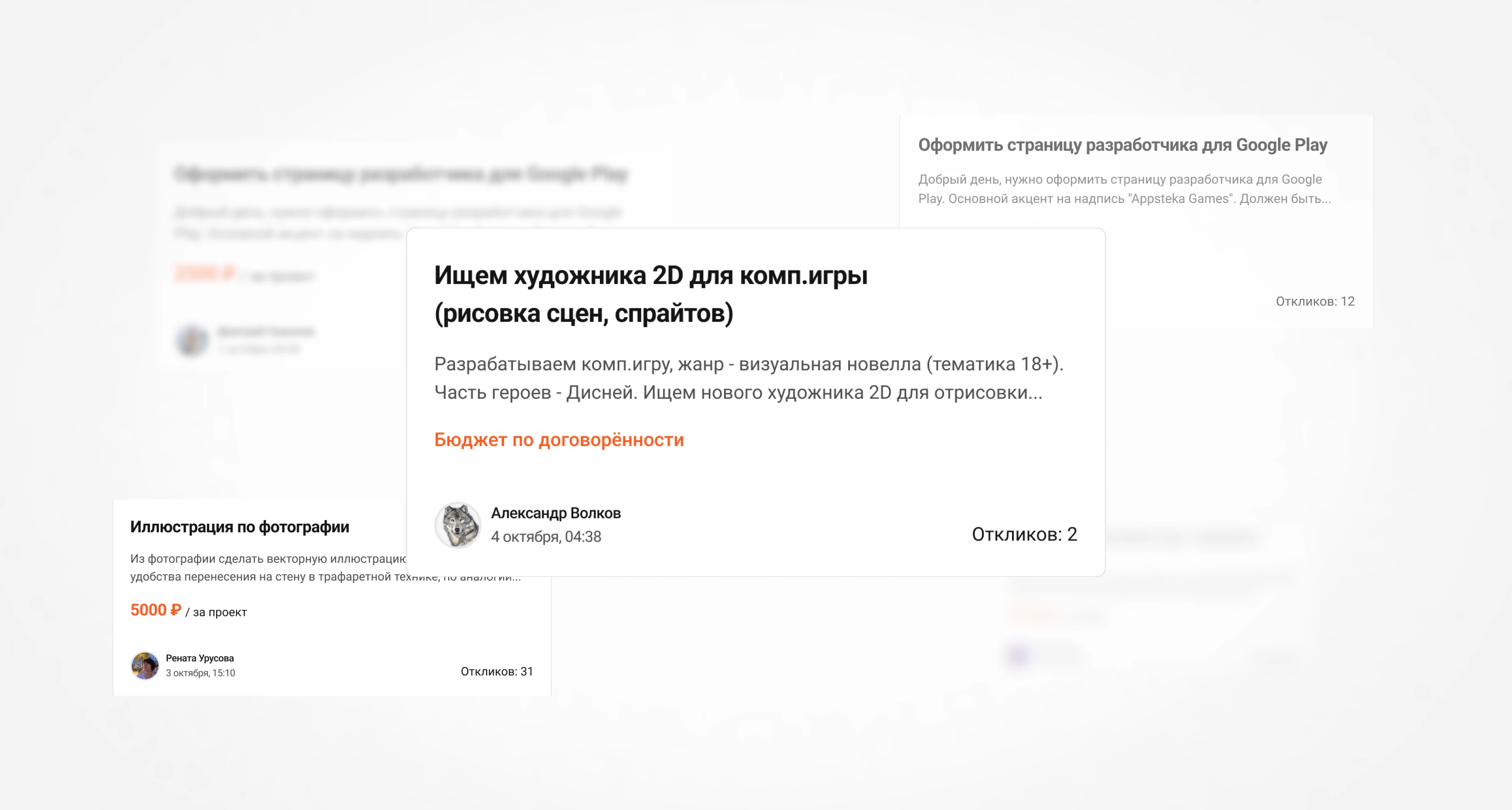
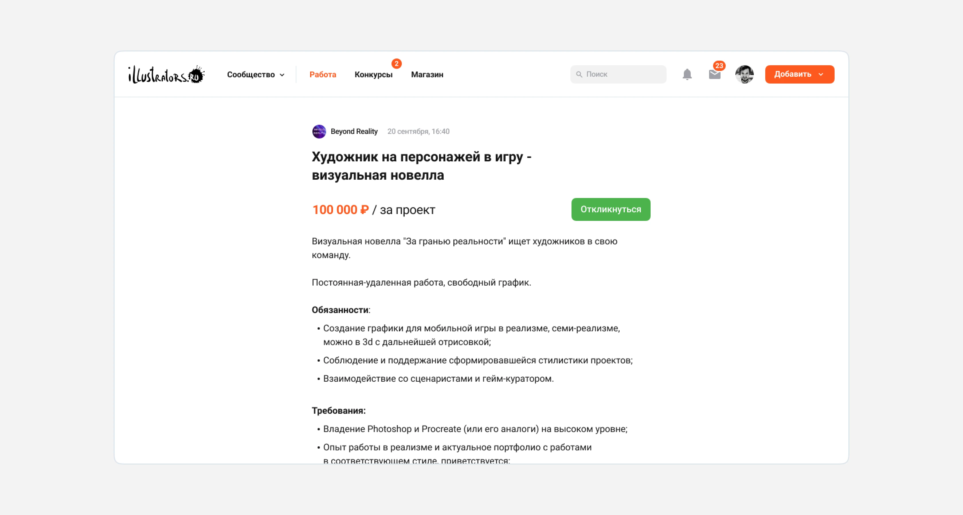
Previously, the "Work" section included contest announcements, while there was also a separate section for contests. It was illogical to combine and duplicate sections, so in the new design, only orders and services remain — those related directly to work. For better search engine indexing, we added a header and description that help the user understand what this section of the site is for.
The button for creating new ads was previously located on a dark banner. Many users didn't notice it and contacted support asking for help in creating an ad. By placing this button in a prominent place, we increased clicks by 25%, and the number of ads also increased.
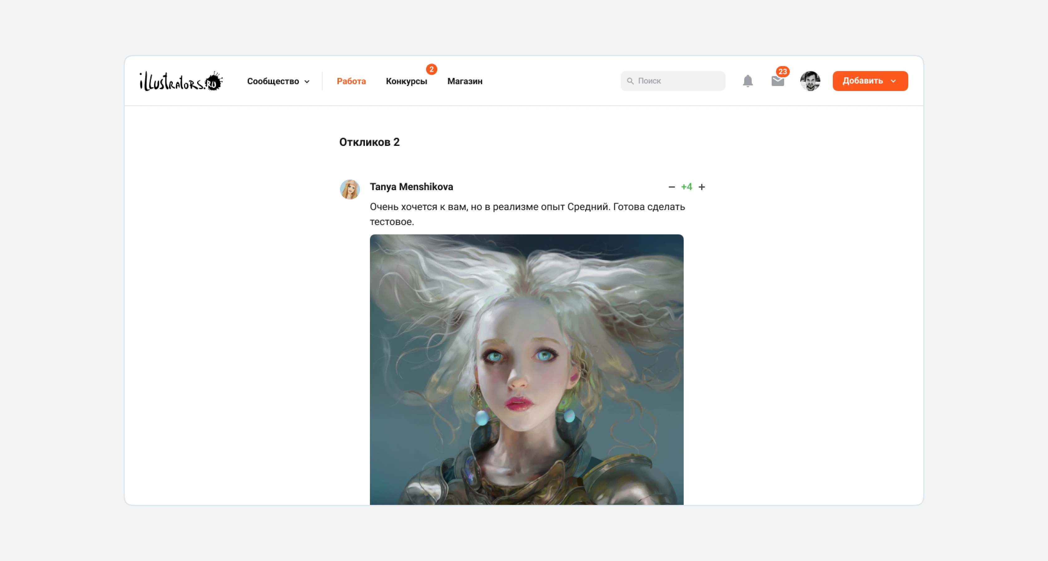
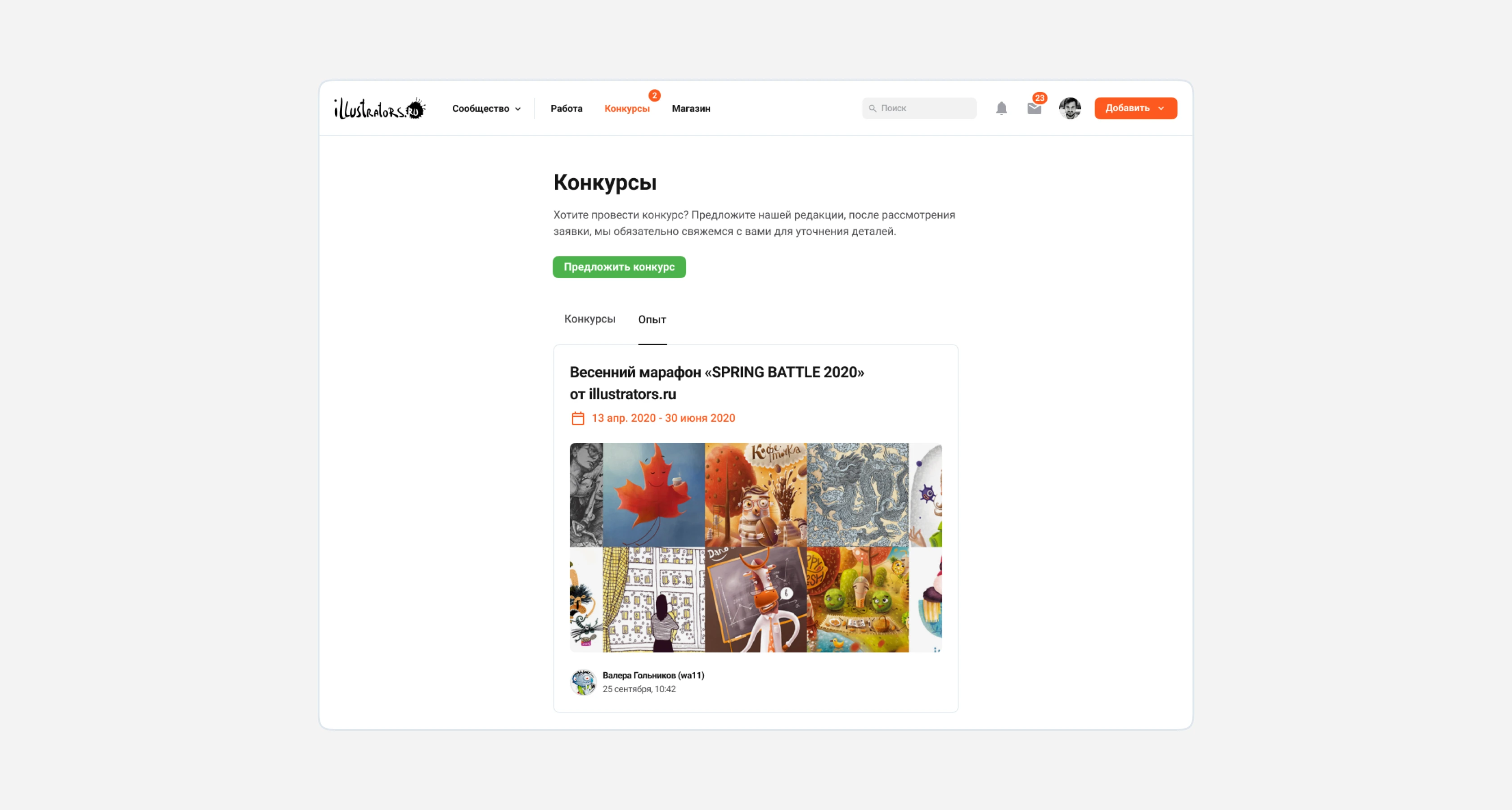
Contests and Experience
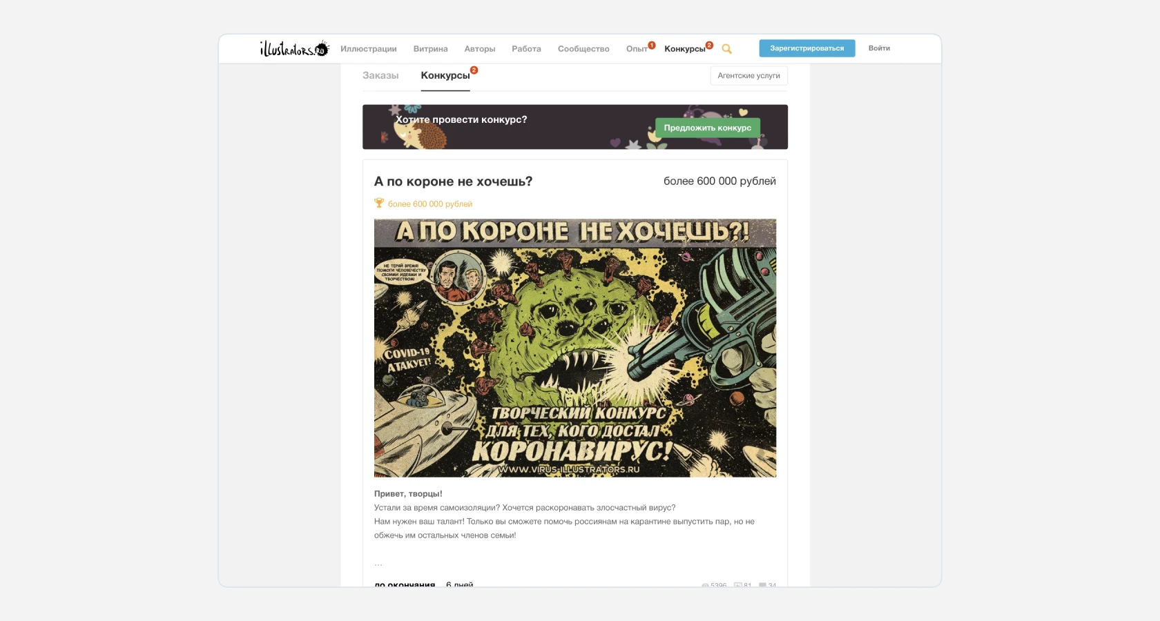
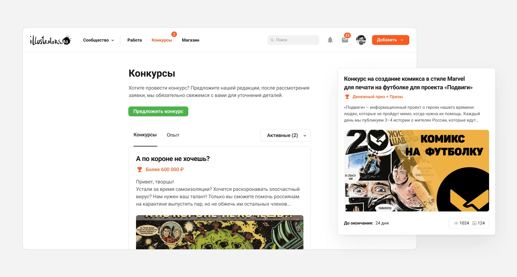
Contests are one of the most important sections of the site, through which the company receives steady income. Initially, users were shown all contests mixed together, including both active and inactive ones. Now, by default, filters are set to show only active contests. If no contests are currently being held, users will be offered to view archived ones. Internal contest pages are similar to job pages. The contest organizer also uses a wysiwyg editor to create a page with a description.
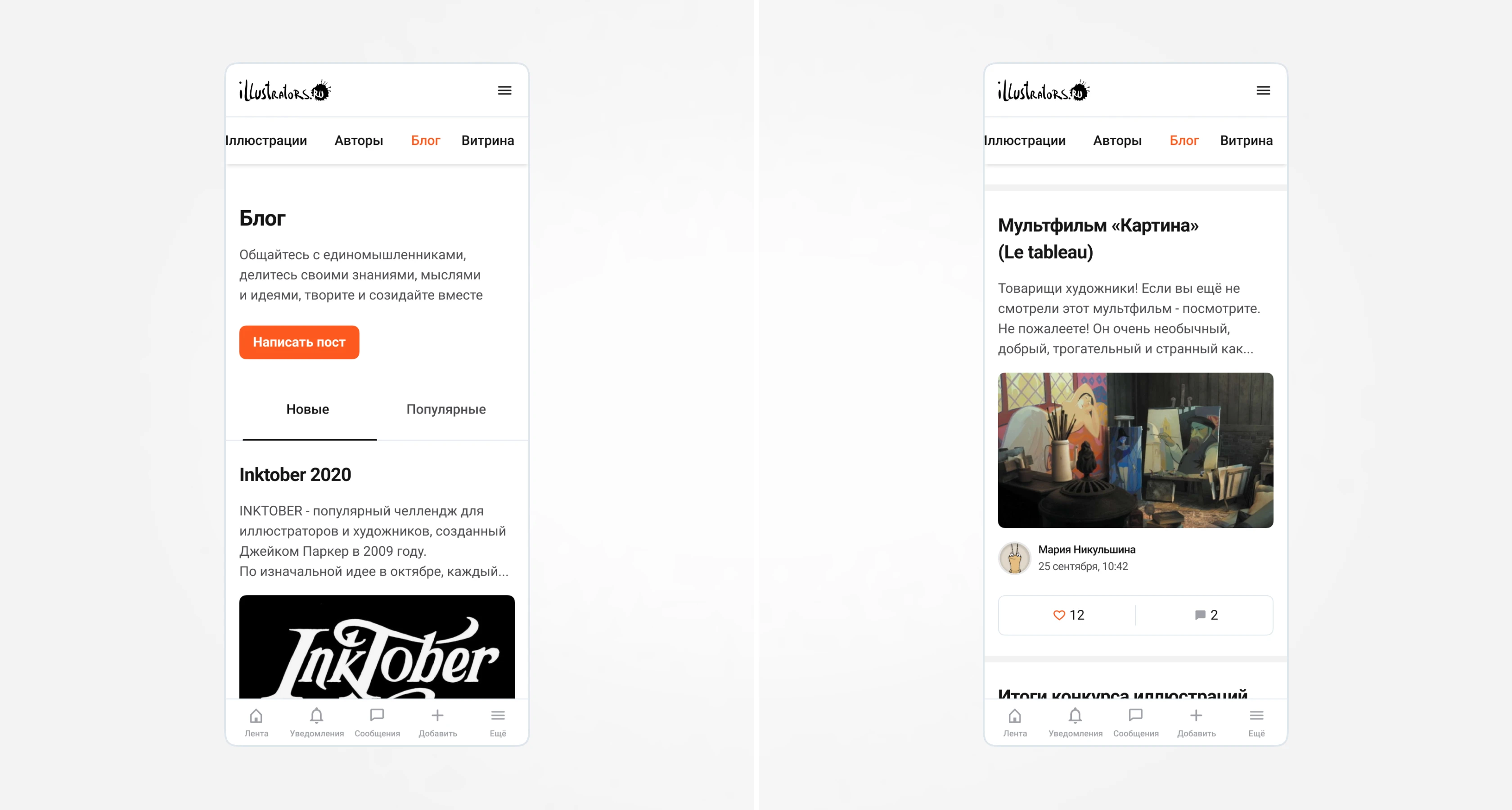
Blog
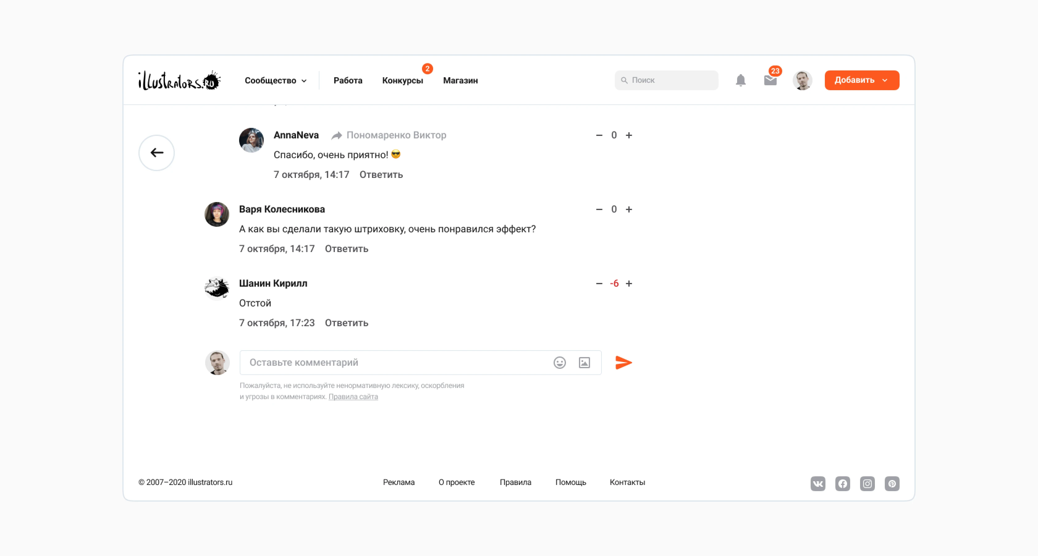
The new blog design has become more minimalist. The issue with the visibility of call-to-action buttons was resolved, similar to the "Work" page. To increase the number of posts in the "Comments" column, the comment text was shortened to three lines.
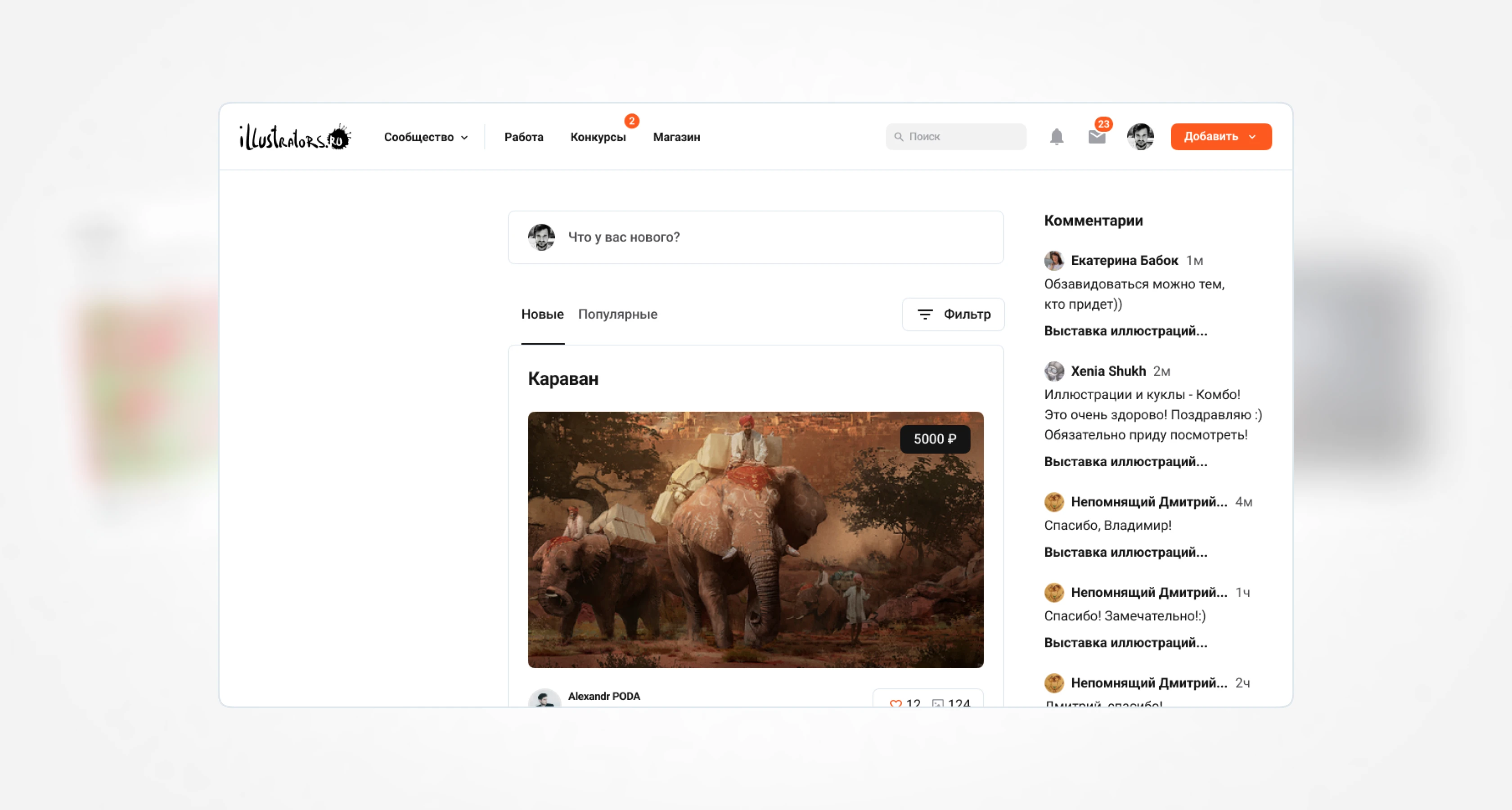
Feed
The Feed is a page almost identical to the blog. In this section, the user sees the content (illustrations, posts, products, ads, contests) of the authors they follow. The structure is identical to the blog, except for the ways of adding a new post. In the blog, the entry point is presented as a button; here it is a small widget.
Private Messages
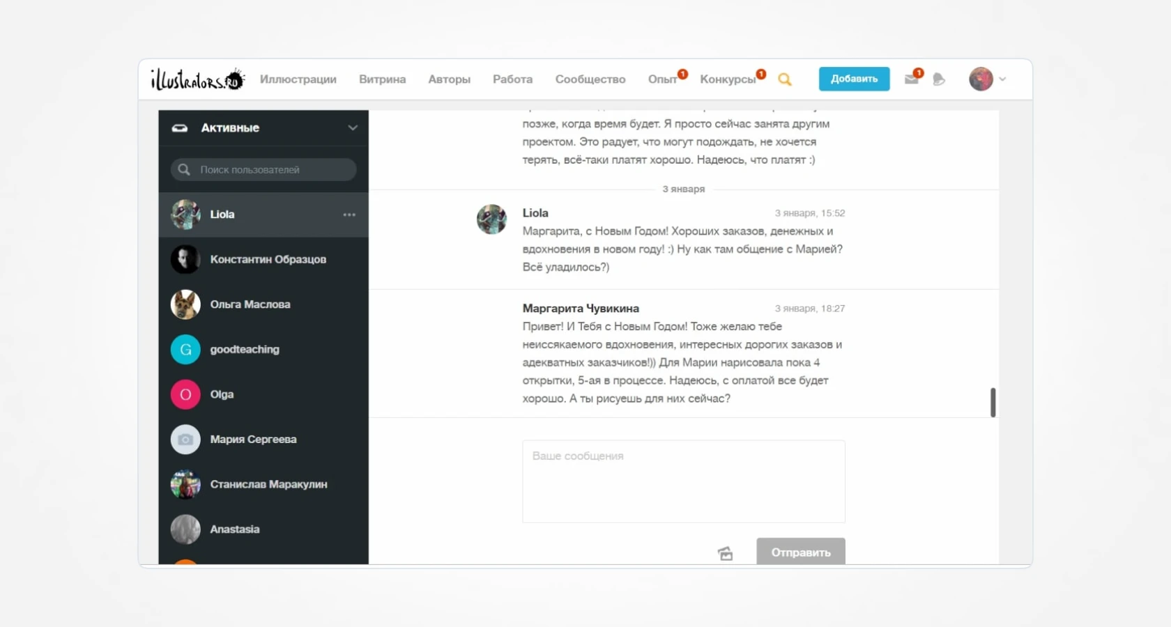
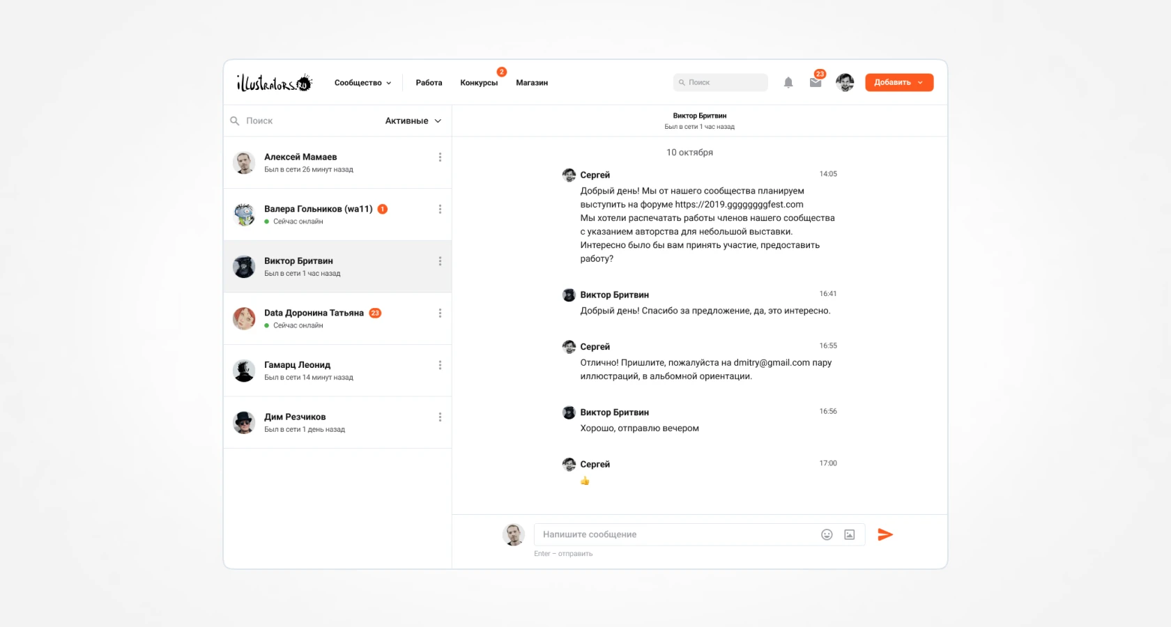
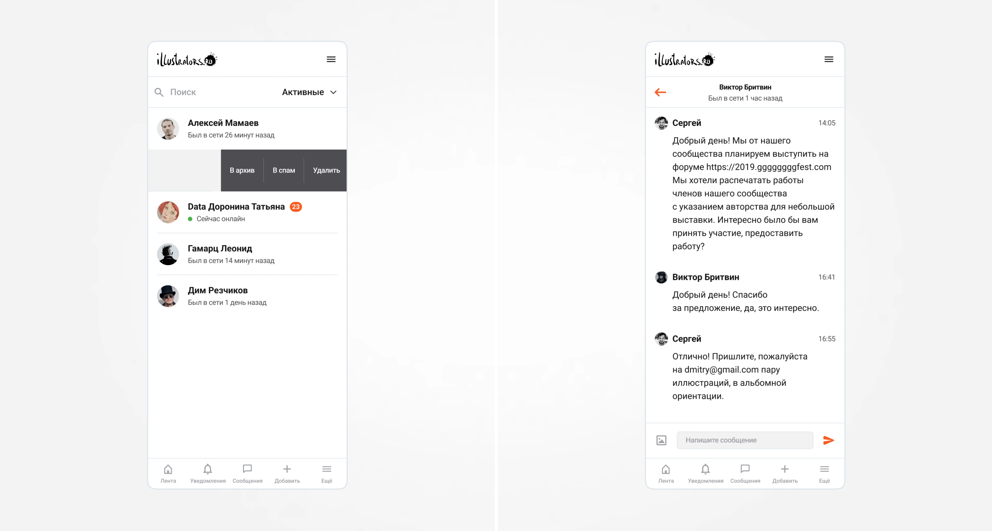
We improved the private messages interface: now the page looks more concise. We also added an indication of the user's online presence and the time of their last online activity. Emoji support was added for more lively communication. Actions in the "ellipsis" icon (archive, spam, delete) are now always visible in the user's snippet.
Adding an Illustration
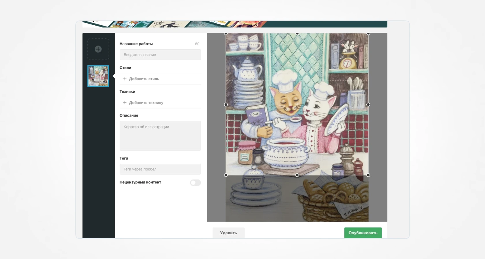
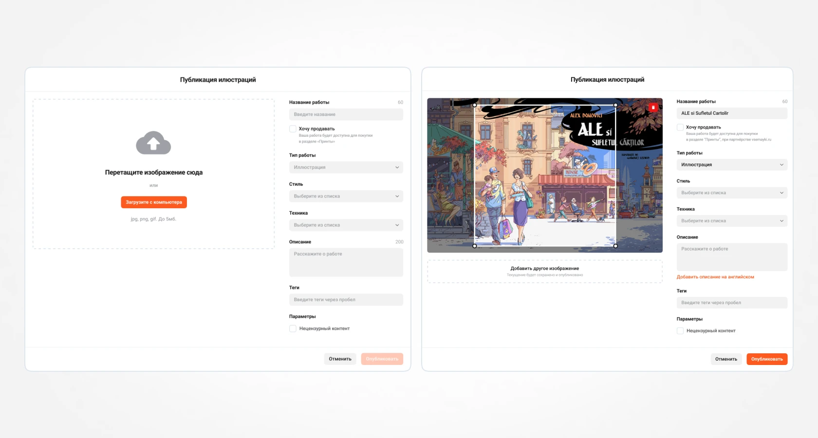
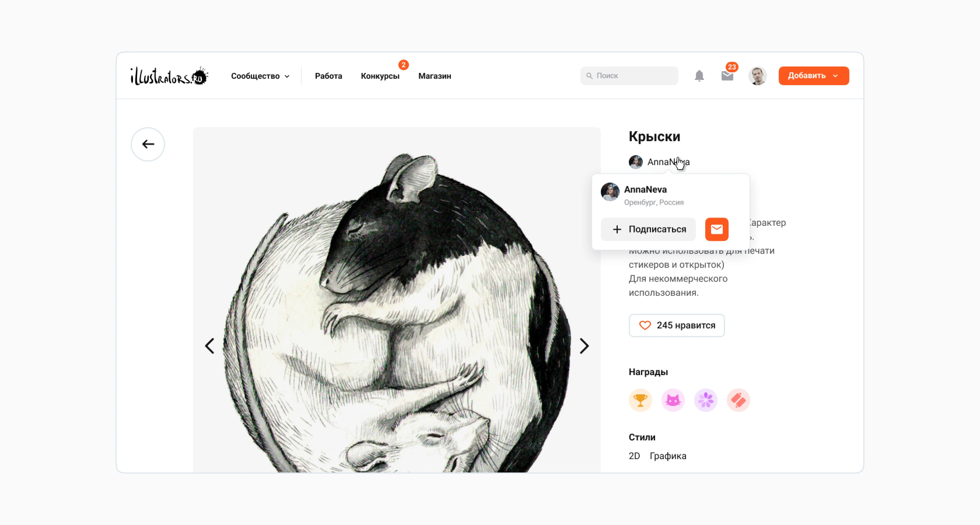
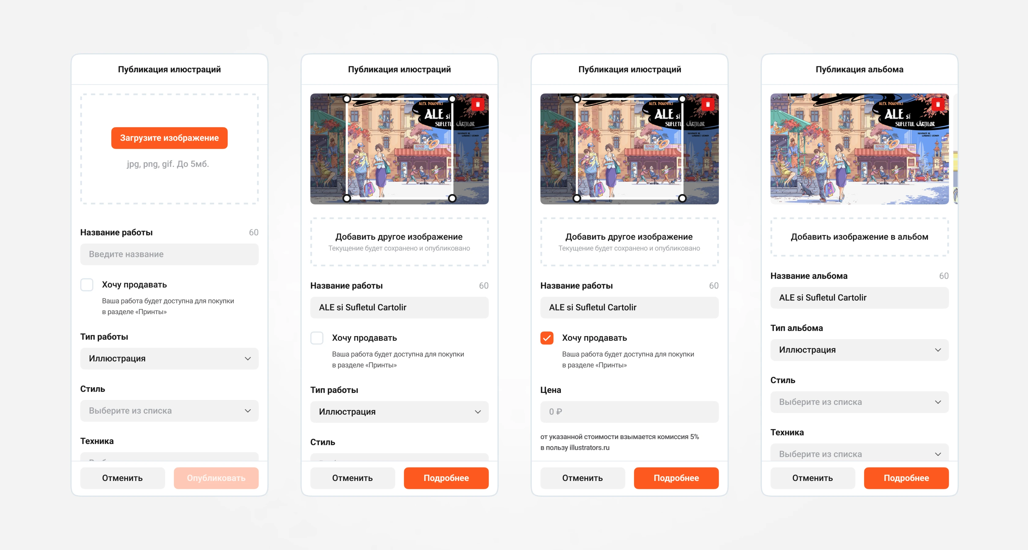
Changes were made to the image placement: now it is on the left and can be cropped with a 1x1 aspect ratio. The illustration selling feature was also added. Previously, the user had to choose the option to add a product; now, it is enough to activate the corresponding checkbox to set a price for their work. If the user wants to add a new illustration, they can drag the file to this screen: the previous image will be published (if it meets validation rules), and the new one can have its information edited.
Adding an Album
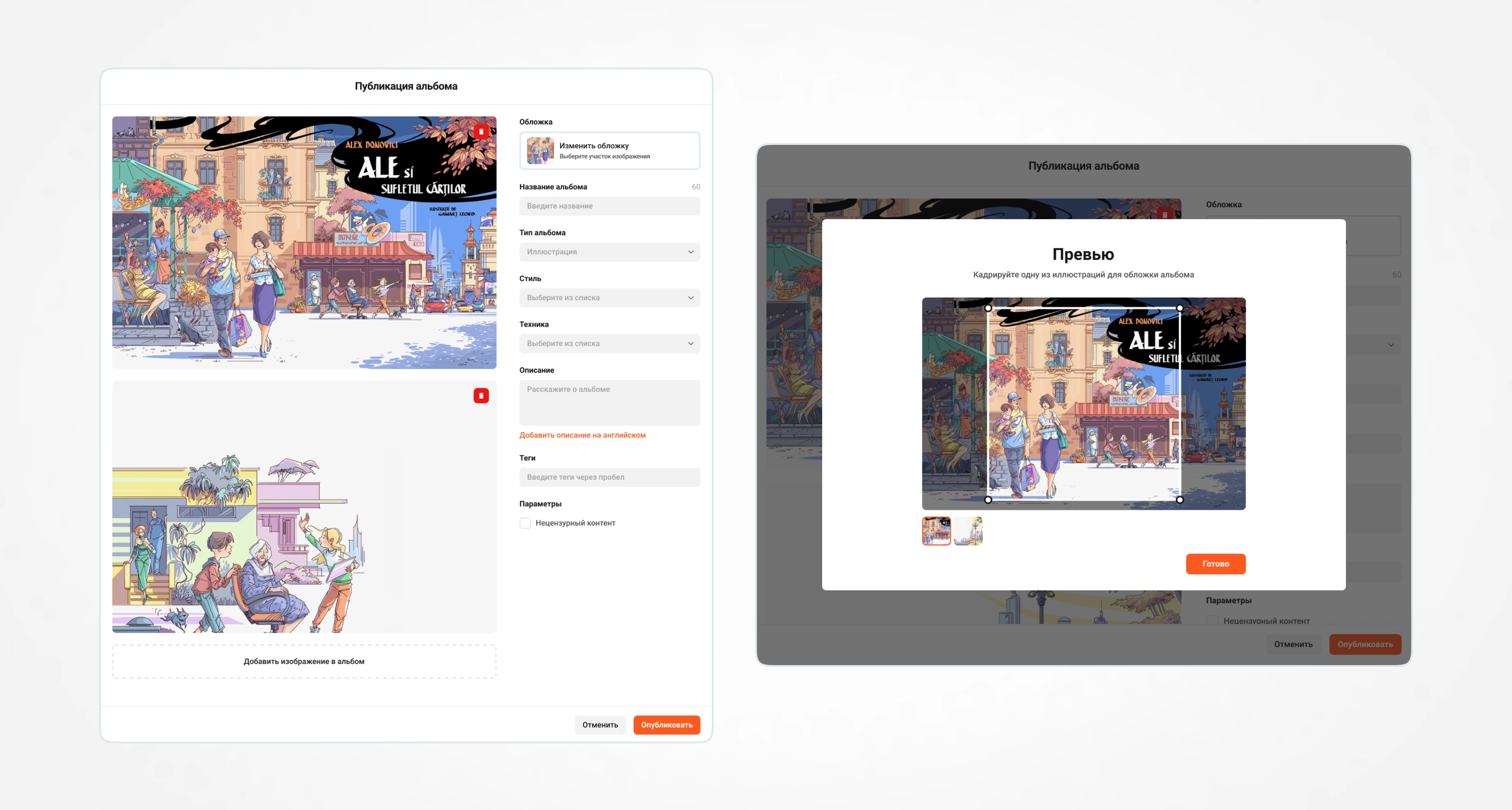
The user can upload multiple images to an album, specify general information for them, and select a preview.
UI-kit
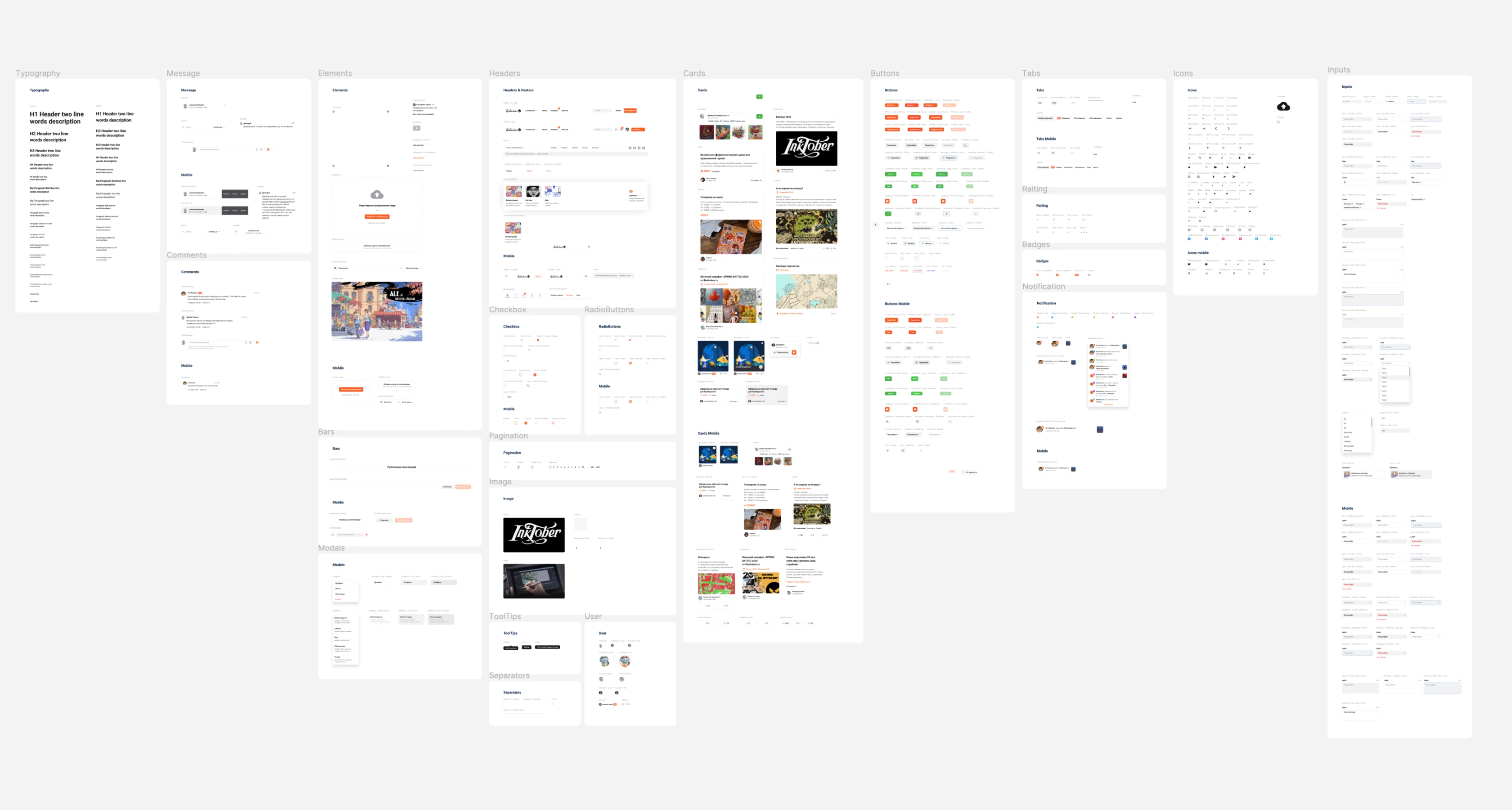
The redesign work was carried out in Figma for quick and easy assembly of layouts. The design was built on UI-kit components.
Result
illustrators.ru in the new design increased user activity in the main sections. Flexibility in implementing improvements has emerged. Downsides: unfortunately, the technical part affected the user experience. The site is written in Ruby, and the site owner didn't have enough funds to attract qualified specialists on this stack, so there are many bugs that are currently being fixed. I hope in the future the site will switch to React with a tokenized design system.
